

Issue 107
Two-step way to disable weather app

Hello, dear readers! 👋
In this issue, among other things:
Why do we need two-page authorization and what are the alternatives
How to improve the design of tables in interfaces
How to use animations to improve the experience of the product. Practical tips
What is the difference between fonts for working with code
17 UX guidelines for designing an effective menu
A blank slate method for memorizing information
One hundred Day UI Design challenge
Free mini course on creating a cinematic location in Unreal Engine
Why did Figma disable the AI Application Design Generator
…and much more!
Enjoy reading!
🗞 News and articles
Figma has disabled its AI Make Design
Figma announced and rolled out a new AI function, Make Design, into a limited beta, which creates application design based on a text prompt.
Andy Allen posted a video and screenshots that show that the tool created a design almost identical to Apple's Weather application for the "weather app" request. That is, the AI was clearly trained on screenshots of existing applications, and this could lead to prosecution for intellectual property infringement.
Figma quickly recognized the problem and temporarily disabled the feature.
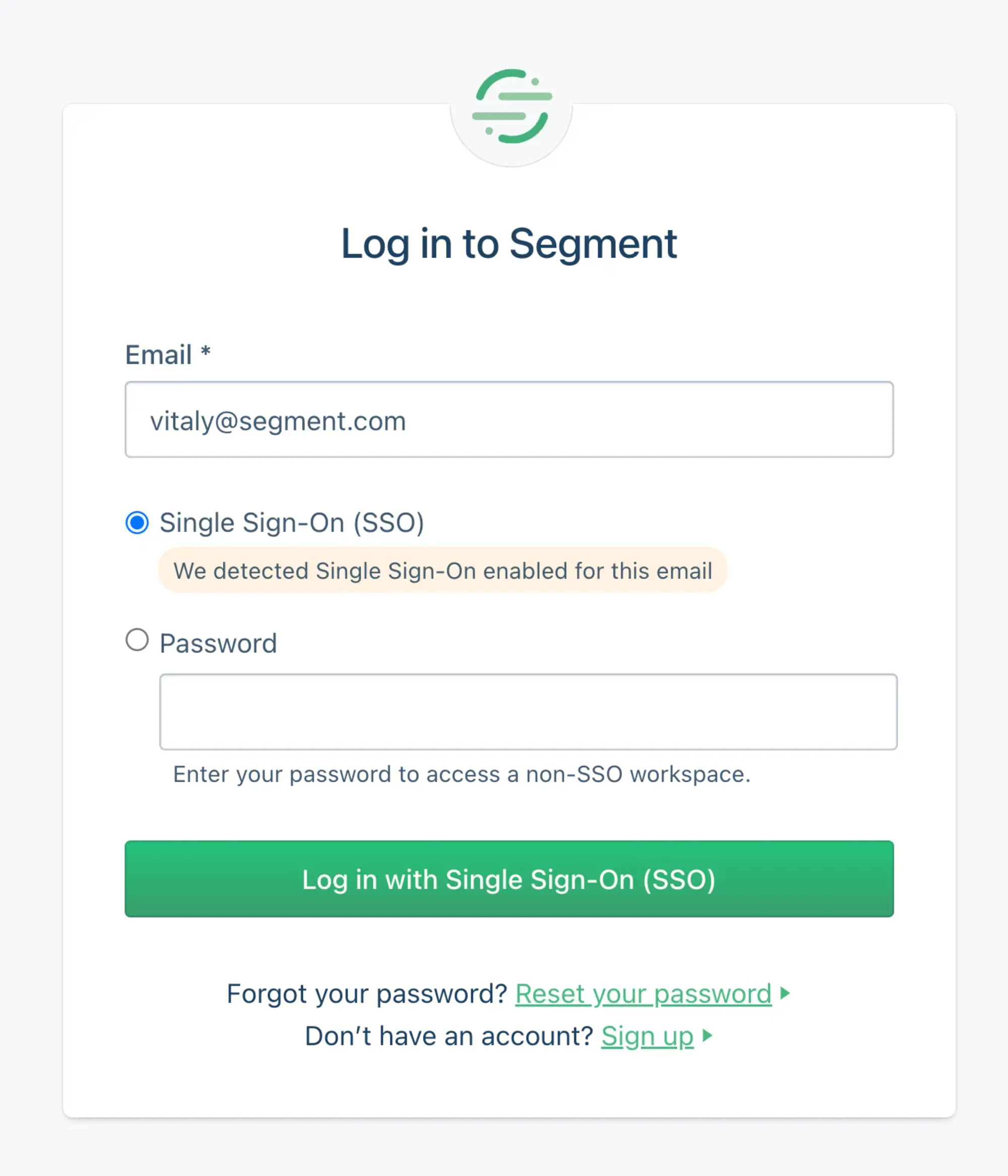
2-Page Login Pattern, And How To Fix It
Vitaly Friedman wrote about two-page authorization. He explained why it is often used, why it was invented and what the alternative is.
On sites with such authorization, you have to enter your email first, go to the next page and enter the password there.
The main thoughts from the article:
Users often forget which email or service they used when registering. But you can't remind them of this on the login screen for security reasons
To simplify the authorization of corporate users on several services at once, single sign-on (or SSO) technology has been developed
. SSO allows you to enter a password once, after which only mail will be needed to access employee accounts on different sites
Two-step authorization was designed so that users with the SSO function do not perform unnecessary actions. The sites themselves identify accounts with this function and skip entering a password, but the authorization of ordinary users is complicated due to an extra step
The disadvantage of two-step authorization is that it often irritates users and breaks the work of password managers
To make it easier for everyone to log in at once, you can create a single form with a field for mail and password, but with SSO recognition. If an SSO is detected, the login button will prompt you to log in using this option, and a regular user can simply enter a password
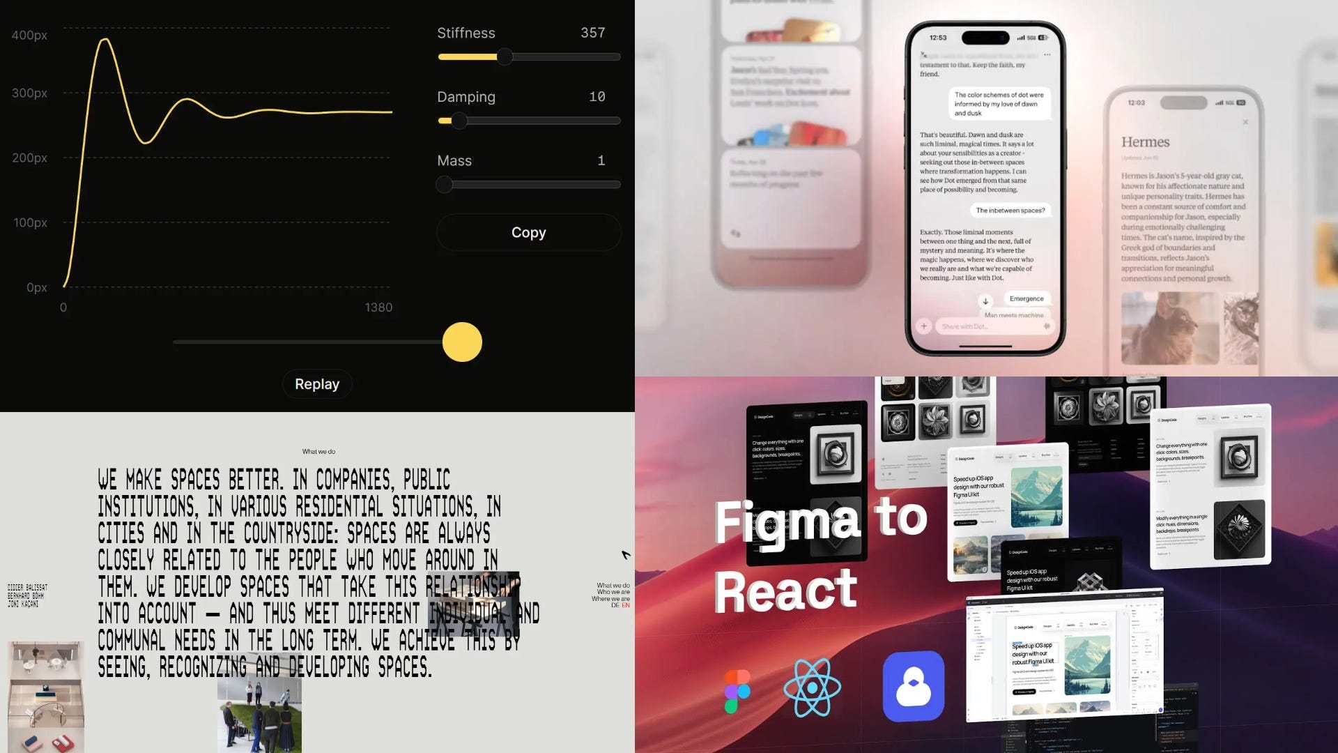
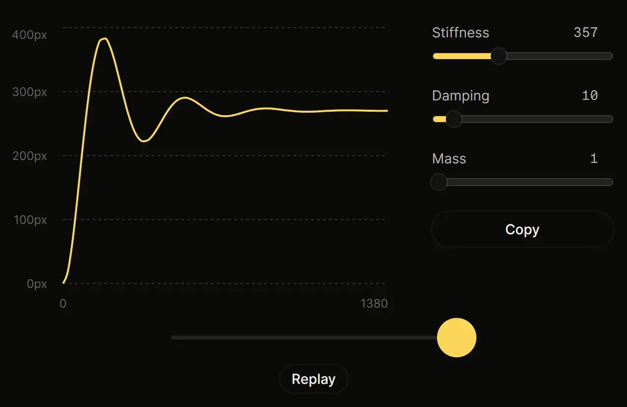
Emil Kowalski explained how to use animations to improve the experience of the product. He shares the principles that help make animations natural, fast, useful and productive. The article contains visual interactive examples and code snippets.
The main thoughts from the article:
People like animations that seem natural, like in real life. This improves understanding and makes the experience more enjoyable.
Fast animations create a feeling of high performance. The optimal animation duration is less than 300 ms
Animations should enrich the information on the page and be relevant. Avoid animations for frequently repeated actions. For example, text input animations can be annoying
The ideal animation frequency is 60 frames per second. It is best to use the transform and opacity properties, as they minimally burden the rendering process.
Animations should be interruptible so that the user can stop them at any time.
Use media queries in CSS to disable animations for those who don't need them.
Align animations with the overall style and spirit of the product to create a seamless experience
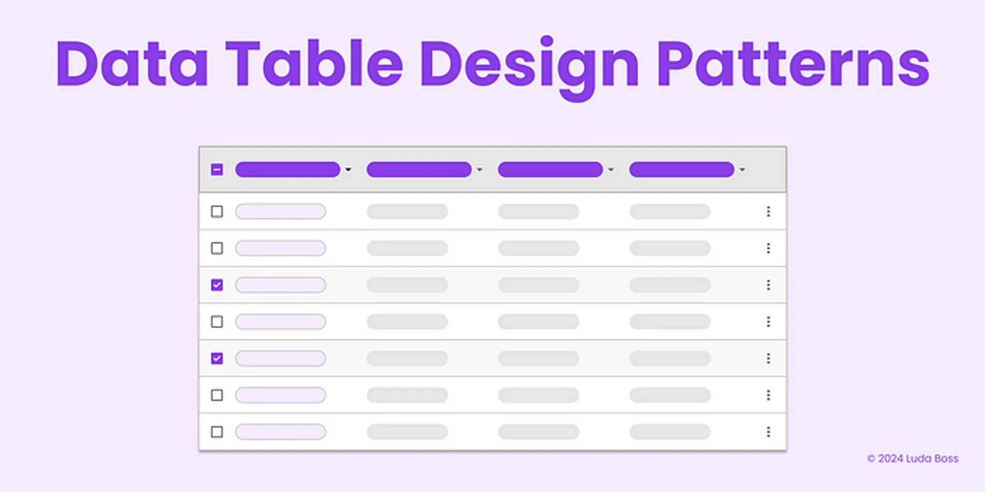
Data Table Design Patterns. Data tables come in various sizes
Luda Boss has collected a number of practical tips on how to improve the design of tables in interfaces. There are excellent illustrative examples in the article.
Some recommendations:
It is better to align text data to the left to improve readability, and numeric data to the right for ease of comparison. At the same time, dates, postal codes and phone numbers can be aligned both to the left and to the right
For numbers, it is better to use monospaced fonts to make them easier to read and compare
Use thin light lines instead of bold separators
In small tables, you can show data without vertical and horizontal separators
The lower the line, the harder it is to read, but you can fit more data. The line height can be divided into three types: compressed — 40 px, regular — 48 px and relaxed — 56 px
Sometimes you can add small labels to cells so as not to create unnecessary rows and columns.
In large tables, you can pin headers and columns when scrolling, as well as add pagination, sorting, table view settings and bulk operations
⚡️ Briefly
Beyond monospace: the search for the perfect coding font. "Evil Martians" wrote about creating a font for developers. They explained why monospacing alone is not enough, which symbols require special attention, and much more.
Keep reading with a 7-day free trial
Subscribe to bezier.design to keep reading this post and get 7 days of free access to the full post archives.