

Issue 111
Ironically progressive retroaesthetics

Hello, dear readers! 👋
In this issue, among other things:
What is the difference between a product designer and a growth designer
How to create clear and effective text for interfaces
How the Atlassian team standardized the drag & drop interface and its implementation
What is the Hawthorne effect in research and how to reduce it
Why polishing interfaces is barely visible, but qualitatively changes the product
Sorted collection of dark patterns in interfaces
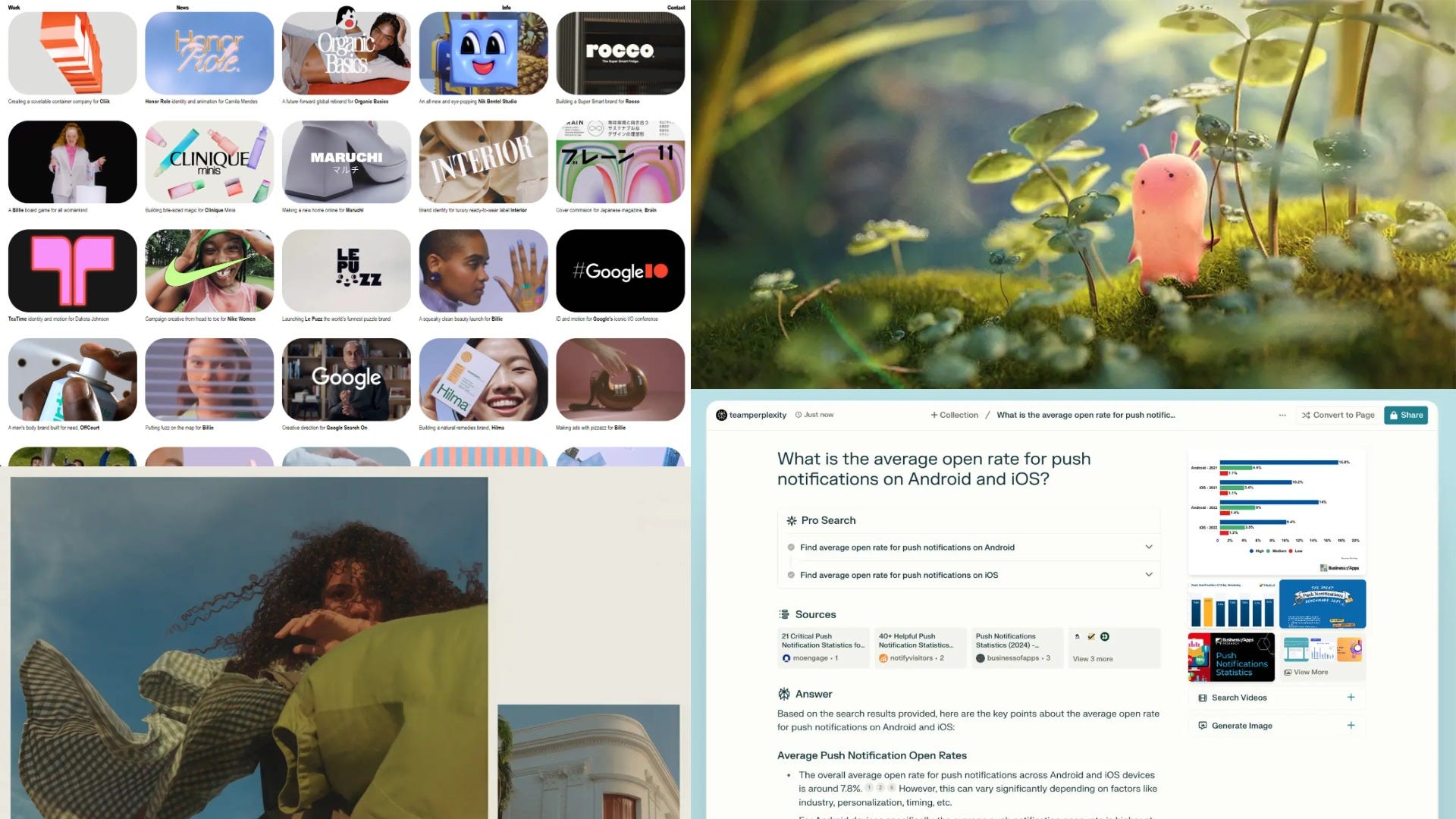
How Product Managers Use Perplexity
…and much more!
Enjoy reading!
🗞 News and articles
Matthew Strem argues that polishing individual interface details may be invisible to the user, but significantly improves the experience of the product.
He gave examples from various fields where subtle and imperceptible adjustments have changed the quality of the product. For example, in the board game Go, the board has an aspect ratio of 15:14 to compensate for optical distortion, and the black stones are slightly larger than the white ones for the same reasons.

How To Improve Your Microcopy. UX Writing Tips For Non-UX Writers
Irina Silyanova told how to create clear and effective text for interfaces based on her experience as a UX editor.
Some tips from the article:
Ideally, the interface text should look like a dialog between the product and the user. For example, headings and hints are product phrases, and buttons and input fields are user phrases.
The text on the buttons should clearly reflect the actions that will occur after they are clicked
Use clear and transparent language, especially when it comes to sensitive topics. For example, about personal data or money
In the examples, use real data instead of conditional data. This way the interface will be more accurate and useful
It is better to place important information at the beginning of the text so that the user immediately notices it
Break down information into easily digestible parts. Show only what is needed at a specific stage to perform an action or make a decision
Make sure that the headings and buttons are clear without the main text and clarifications. Users often scan the screen rather than read everything in full
Avoid technical jargon so that the interface is understandable to a wide audience
Use verbs instead of nouns to describe actions. This will make the text more concise and understandable
Avoid the words like "oops" in error messages. It annoys users
Designed for delight, built for performance
The Atlassian guys talked in detail about how they managed to standardize the drag & drop interface and its implementation in their products. To do this, they developed their own modular pragmatic drag and drop solution, which allowed not only to achieve consistency, but also significantly improve performance.
In the article, the team described the design process, the limitations they faced, the subtleties of the solution itself, and also shared the code.

Growth Designer vs. Core Product Designer — A cheat sheet
Siva Sabaretnam from Atlassian conducted her own analysis and talked about the difference between a product designer and a growth designer. She explained how these roles differ in goals, approaches and working methods using the example of the Atlassian team and products.

Keep reading with a 7-day free trial
Subscribe to bezier.design to keep reading this post and get 7 days of free access to the full post archives.