Issue 124
Badass portfolio fix
Hello, dear readers! 👋
In this issue, among other things:
A guide to using translucent colors in interface design
Why do users still want to think
What mistakes in the portfolio will make you an undesirable candidate
Why in 20 years people will forget how to think
Practical tips for combating procrastination
The winners of the world packaging design competition
A short film about seclusion
A free iOS application for generating images based on a sketch
…and much more!
Enjoy reading!
🗞 News and articles
Woah, opacity! A full guide to this badass hero of efficient UI design
Irina Nazarova from "Evil Martians" has released a guide on the use of translucent colors in interface design. She explained how such colors can reduce the number of styles and options for components and simplify the design process. They allow you to create universal solutions for buttons and themes, while maintaining accessibility and performance.
The main thoughts:
Translucent colors help to maintain the visibility of elements, under which the background color can often change. For example, the buttons
The gamut of the interface with translucent elements can be changed simply by repainting the bottom layer. This simplifies customization when the user has the opportunity to choose any shade of the theme.
The availability of the translucent gamut will depend heavily on the background. For example, the contrast may be higher on a light background than on a dark one
When superimposing elements on top of each other, it is important to keep in mind that the colors will mix. For example, there will be brighter dots at the intersection of the lines, which should be avoided
Translucency may not work well on low-performance devices. For example, on 10-year-old smart TVs and smartphones
Also, the author puts together two online demos: to check contrast and to test devices for performance when processing translucent colors.
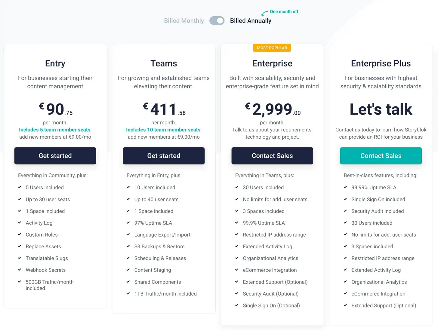
Designing A Better Pricing Page
Vitaly Friedman talked about how to create a page with prices correctly, how users scan the page studying the information, how to emphasize the differences between tariff plans and how to help users compare them. Vitaly also analyzes a lot of real-world examples and explains which solutions can be useful.
Ivan Sipilov explained why the well-established concept that users don't want to think is no longer relevant. This idea was proposed by Steve Krug in the book "Don't Make Me Think" and has become very popular in the UX industry.
Ivan points out that in some cases, users want to dive deeper into the selection process, especially when it comes to serious and long-term solutions.
As an example, he analyzed in detail his own project — a platform for renting real estate in New York. In it, he focused on comparing a variety of options, filters, renting equipment and even virtual fitting of furniture in the apartment. Testing showed a threefold increase in session time and a 43% increase in the conversion rate of some stones compared to others.


