Issue 125
Steve Jobs' tips on error-resistant toasters
Hello, dear readers! 👋
In this issue, among other things:
Dark patterns in the process of buying Photoshop on the Adobe website
The subtleties of working with fonts on the web and the font-size-adjust property
Design pricing tips
A tool for Figma prototype analytics
Packing brandy in the form of a volcano
High-quality commercial graphics of the analytical platform
Steve Jobs' tips on how to create amazing products
…and much more!
Enjoy reading!
🗞 News and articles
The Prophecy design team has compiled a step-by-step practical guide to product development. It focuses on user engagement and highlights six key stages: research, systematization, idea, prototyping, collaborative creativity and iteration design.
The authors emphasize that there is no universal design process, but this set of actions can serve as a good basis.
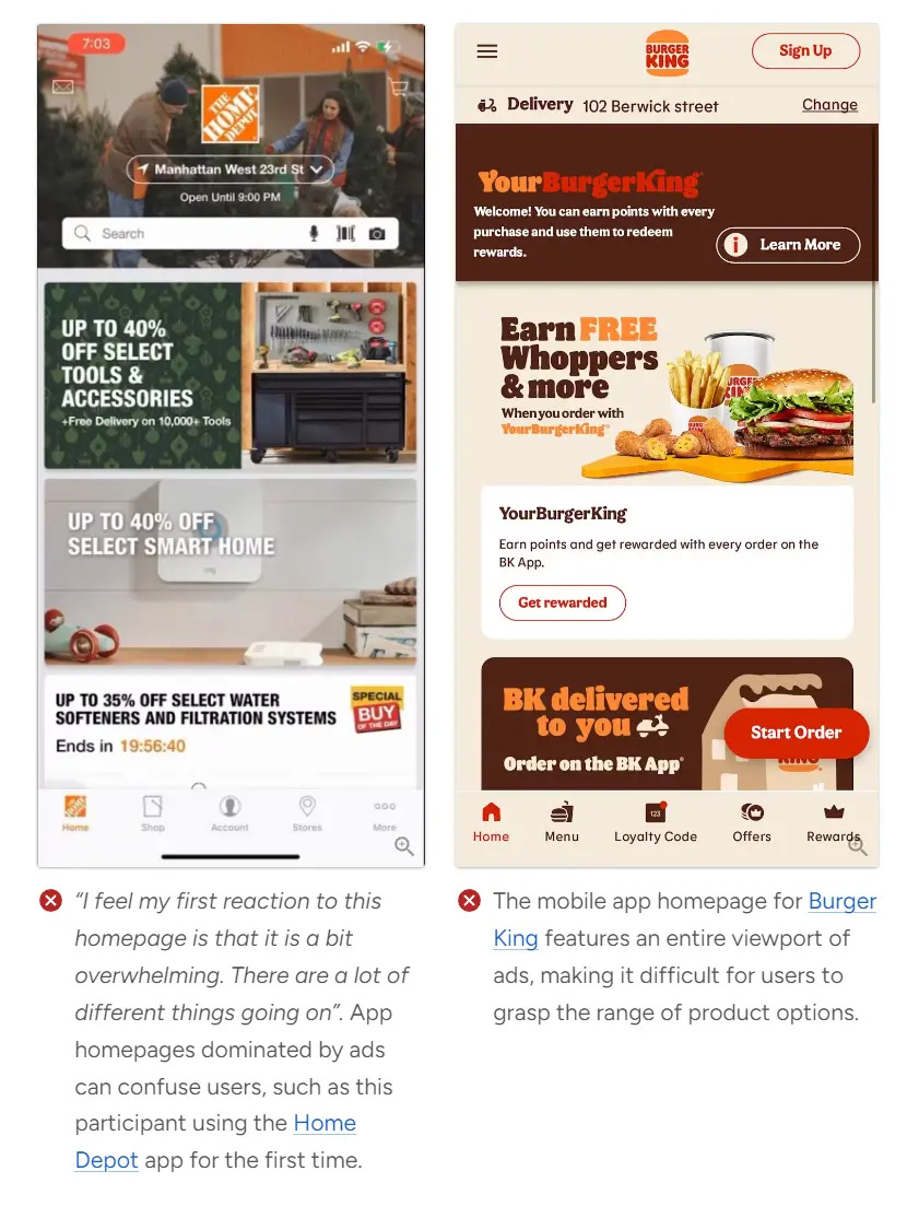
The Current State of Mobile App UX. 10 Common Pitfalls & Best Practices
Baymard Institute 10 has released an article about the main flaws in the applications of online stores in the USA and Europe. Among them are problems with navigation and search, lack of information, excessive advertising and other shortcomings. According to the study, 88% of mobile apps have average or low user experience scores.
In total, as part of the study, the authors analyzed more than 8000 elements in 26 popular applications. The full report is available by paid subscription and contains over 7,000 examples of the worst and best practices.
Adobe: The growing issue with «Free» trials UX
Growth.Design analyzed the process of purchasing a subscription to Adobe Photoshop and talked about the disadvantages. They not only found potential growth points, but also looked at how dark patterns work with supposedly free trial access.
The Chaotic Neutral Nature of Font-size
Rasmus Phloe wrote about the difficulties of working with font size on the web. He explained what the font-size property actually means, where it came from, and why the actual font sizes in the browser are often unpredictable.
As a solution, Rasmus suggested using the new font-size-adjust property, which allows you to control the actual height of fonts.
The article contains code examples, visual illustrations, and even a mini-stand for checking the parameters of your fonts.
The main thoughts:
The font-size property came from the world of physical metal fonts, where it meant the actual height of the entire letter along with the pad, not just the sign
If you change one font to another, you may need to adjust the font-size and line-height properties
When combining two or more fonts in one line, adjustments will also be required.
The font-size-adjust property allows you to trim the line borders according to the actual height of the characters using the cap-height and x-height parameters, which are stored in the font itself. The first one cuts off the uppercase ones, and the second one cuts off the lowercase ones
At the time of publication, the font-size-adjust property is not supported by all browser versions. In such cases, you can extract the cap-height and x-height font properties manually (there are code examples in the article)
Some variable fonts change height when changing width or weight. This is reflected in the cap-height and x-height parameters, so it is better to use static fonts.
⚡️ Briefly
Key aspects and common mistakes of pricing design work. Readymag has collected design pricing tips from experts with different backgrounds.


