Issue 152
Echoes in artificial neon paradise

Hello, dear readers! 👋
In this issue, among other things:
How to abandon traditional prototyping in Figma and switch to AI tools
Tips from the employees of Anthropic on how to prompt
AI Interface generator
An audio-visual story about how musicians steal samples from each other
The State of AI report
…and much more!
Enjoy reading!
🗞 News and articles
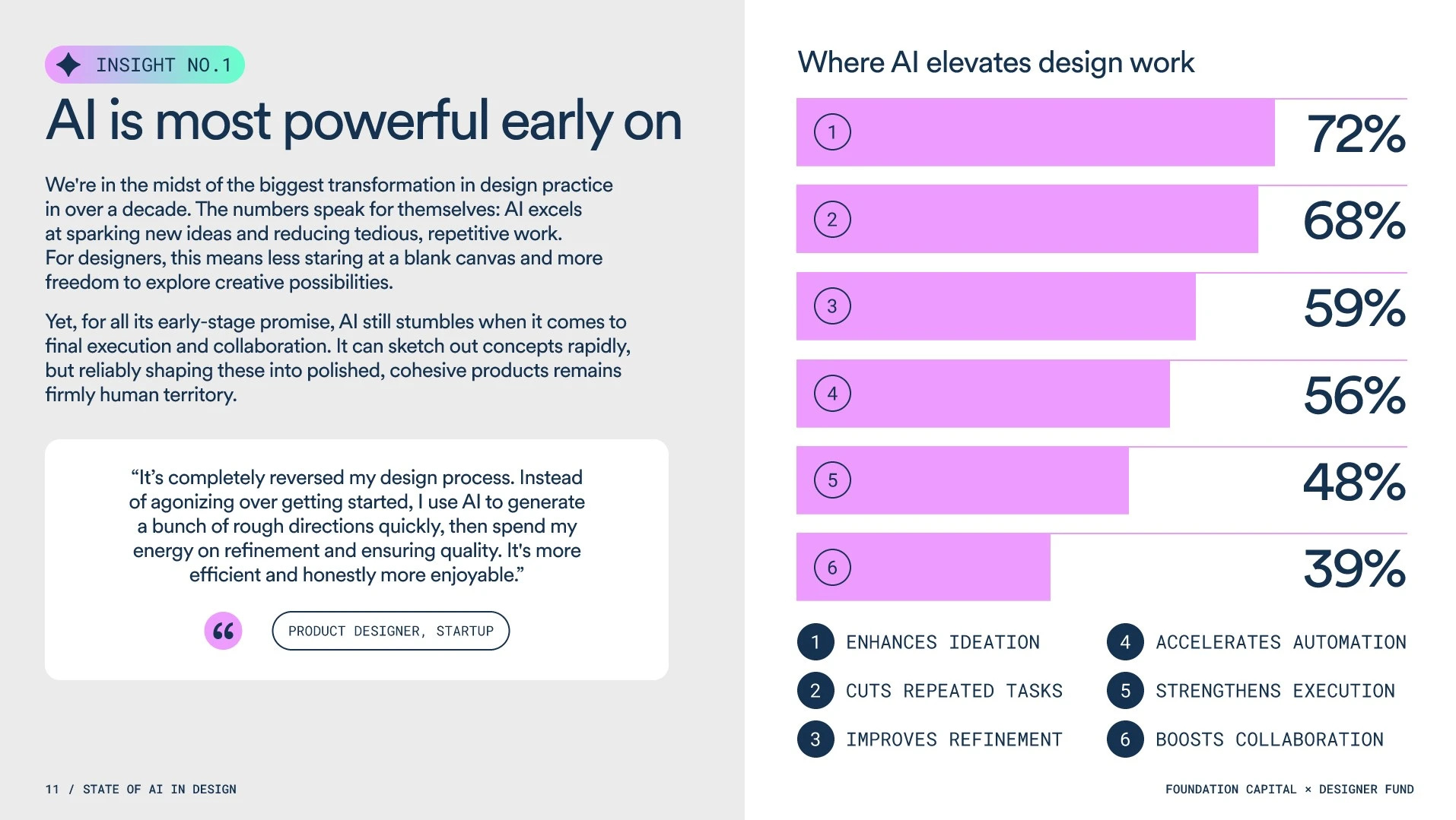
Foundation Capital and Designer Fund have released a report on the impact of AI on design in 2025. It is compiled on the basis of surveys of more than 400 designers and conversations with the heads of Stripe, Notion and Anthropic.
The main conclusions:
89% of designers said that AI have improved their workflow, for example, eliminated routine and accelerated prototyping.
Most designers use several AI tools, but so far they don't fit together well.
Most often, teams turn to AI in the early stages of a project for research, idea generation, and strategy development.
96% of designers have studied AI on their own. Despite the fact that employers are increasingly demanding knowledge of AI, companies rarely organize internal training for employees.
Designers in startups are twice as likely to use AI than their colleagues from large companies.
AI is great for getting started, but the last 40% of the project — getting to the desired result— is still in human hands.
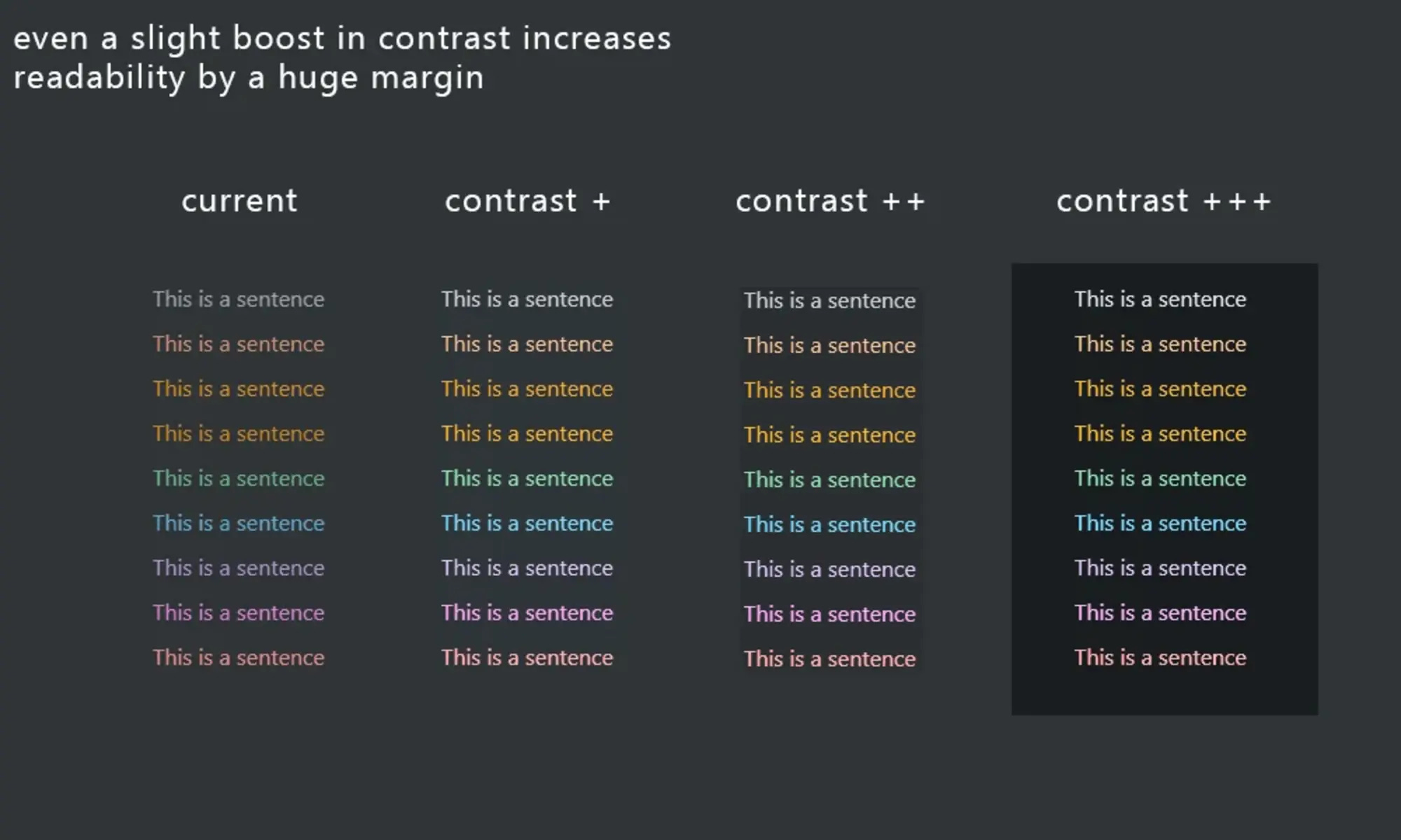
Inclusive Dark Mode: Designing Accessible Dark Themes For All Users
Alex Williams explained how to design a dark theme in the interfaces so that even users with visual impairment would feel comfortable.
The main tips:
Use high-contrast color combinations for text and important elements, but avoid overly saturated colors: they can tire the eyes.
Instead of a pure black background, use dark gray shades, for example #121212
Check the contrast using tools such as WebAIM. Make sure that interactive elements such as buttons and links have a contrast ratio greater than 4.5:1.
Give preference to sans-serif fonts: they read better on a dark background.
Increase the font size and boldness in key elements
and use light accents to highlight titles, buttons, and important information.
Test the interface. For example, ask a visually impaired person to evaluate it, check the interface on different devices and in different lighting conditions.
Give the user the ability to adjust brightness and contrast, and choose between light and dark themes.
Avoid complex patterns and red-green combinations.
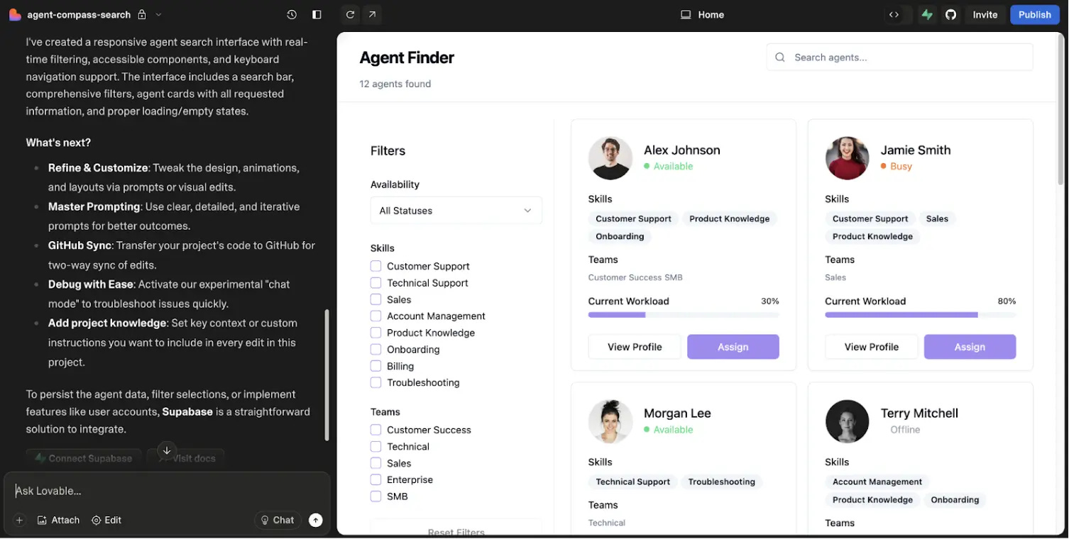
Prompt to Code: Why I Stopped Prototyping in Figma and What This Means for Product Designers
Product designer Elie Thomas Majorel explained how he abandoned traditional prototyping at Figma and switched to AI tools. Eli created sketches in Miro and wrote a technical specification in Claude, which he then used as a prompt for Lovable, where he generated working React applications.
The main conclusions from the article:
Traditional prototyping in Figma is ineffective. It takes a lot of time and shifts the focus from the benefits of the design to its appearance, and the resulting layouts are often impossible or very difficult to repeat in practice.
With the help of the new AI workflow prompt-to-code, you can get a working prototype in just a few hours.
When creating a prototype, the AI writes its code, which the designer shares with the programmers. Therefore, developers can immediately focus on improving functionality and not waste time studying and adapting layouts.
AI helps to test prototypes for convenience and efficiency. This allows the designer to focus on the user experience rather than endlessly polishing layouts.
The launch of Figma Make shows that the design industry is moving away from static layouts to interactive prototypes in code. Now the design process will go through the following stages: idea → prompt → working code → testing → making edits
Designers need to learn how to work with tools, understand code, analyze data, and conduct research.
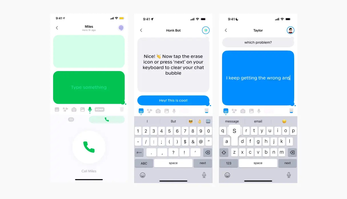
Designer and founder Benji Taylor talked about an unusual Honk messenger with a presence effect. It was a real-time chat: both interlocutors seemed to be writing on the same board, and each of them immediately saw what the other was typing.
Honk illustrates how attention to detail, unobtrusive animation and non-standard solutions allow you to create an application with a really cool UX. Some of the messenger's design features can be adopted and applied in your projects.
On the other hand, even a cool UX does not guarantee that the product will be successful. This happened with Honk, which today exists only on mockups.