Issue 155
Algebraic metaprompted brain

Hello, dear readers! 👋
In this issue, among other things:
Thoughtful and grounded criticism of Liquid Glass, Apple's new style
How the hamburger menu became the standard
Why limitations help you think deeper and more productively
Why AI won't replace us, and design won't die
A great playlist on linear algebra
New free online Anthropic course
…and much more!
Enjoy reading!
🗞 News and articles
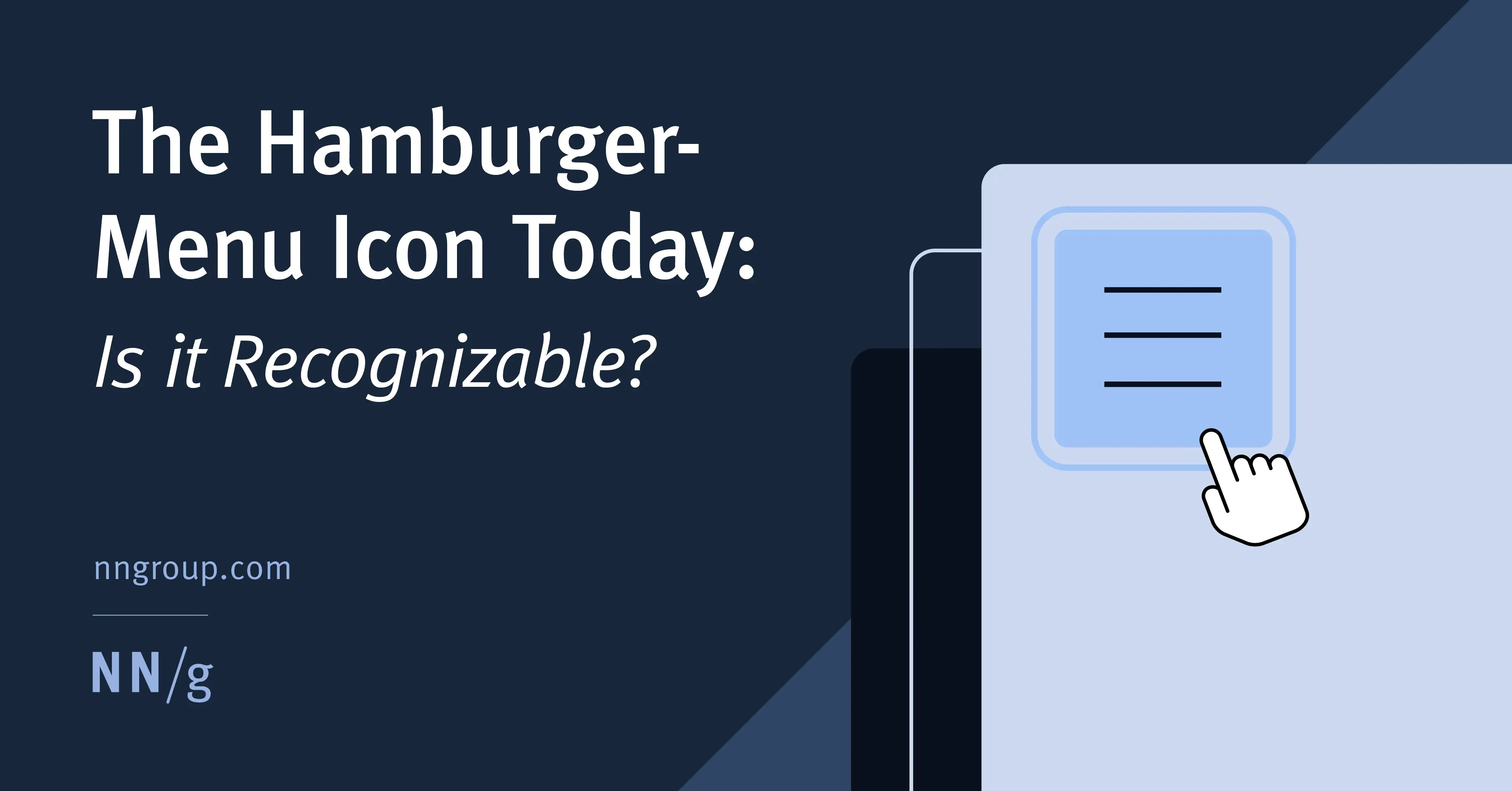
The Hamburger-Menu Icon Today: Is it Recognizable?
NNGroup conducted a study on the convenience and recognizability of the hamburger menu and gave recommendations on its design.
In ten years, the hamburger icon has evolved from a controversial solution to a full-fledged standard.
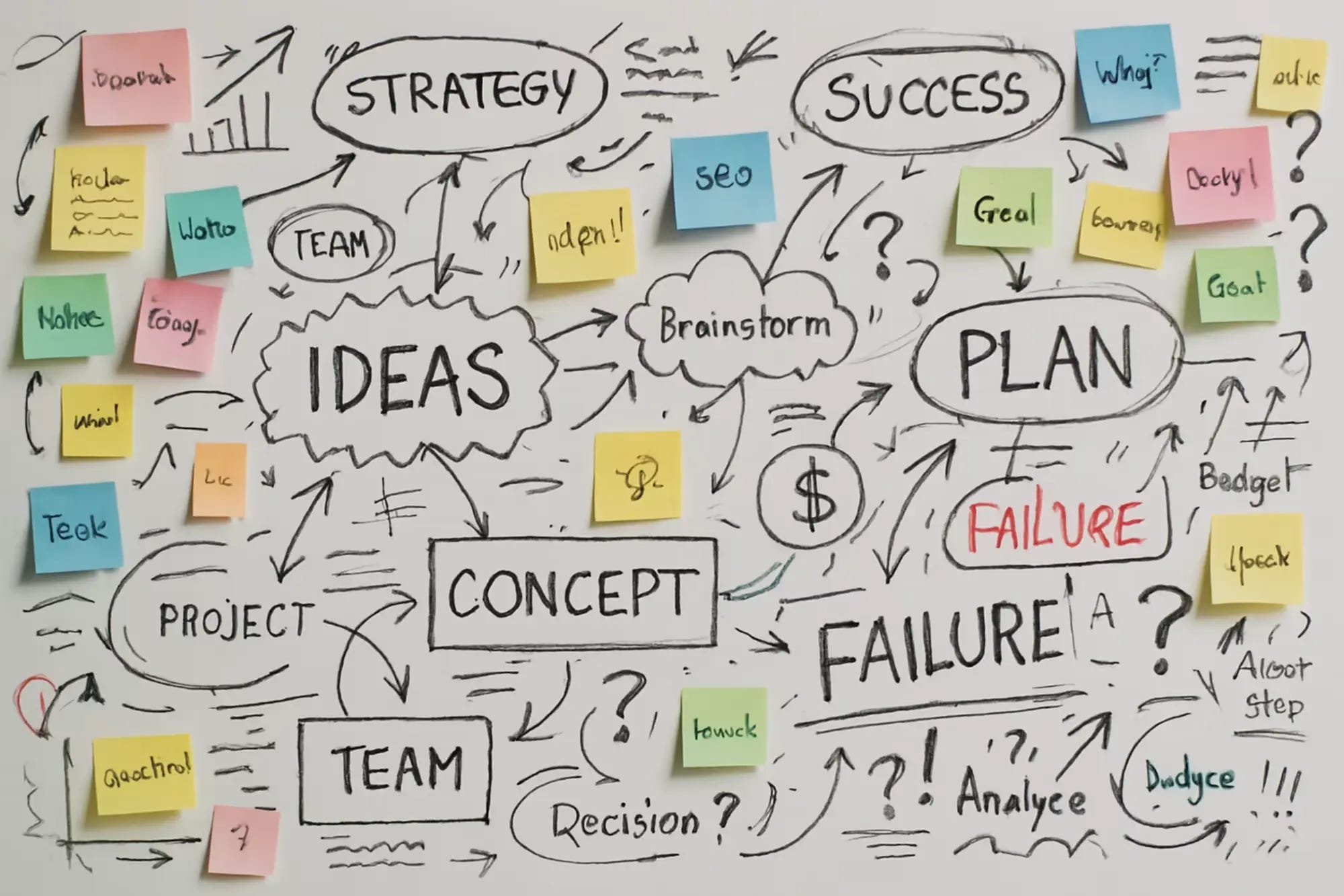
Fewer Ideas: An Unconventional Approach To Creativity
Eric Olive explained why standard methods for finding solutions, like brainstorming or idea lists, don't work. Instead of trying to come up with as many as possible, he suggests focusing on a smaller but more meaningful number of solutions.
In the article, Eric analyzed three practical approaches and gave real-life examples from history to show how limitations and focus help you think deeper and more productively.
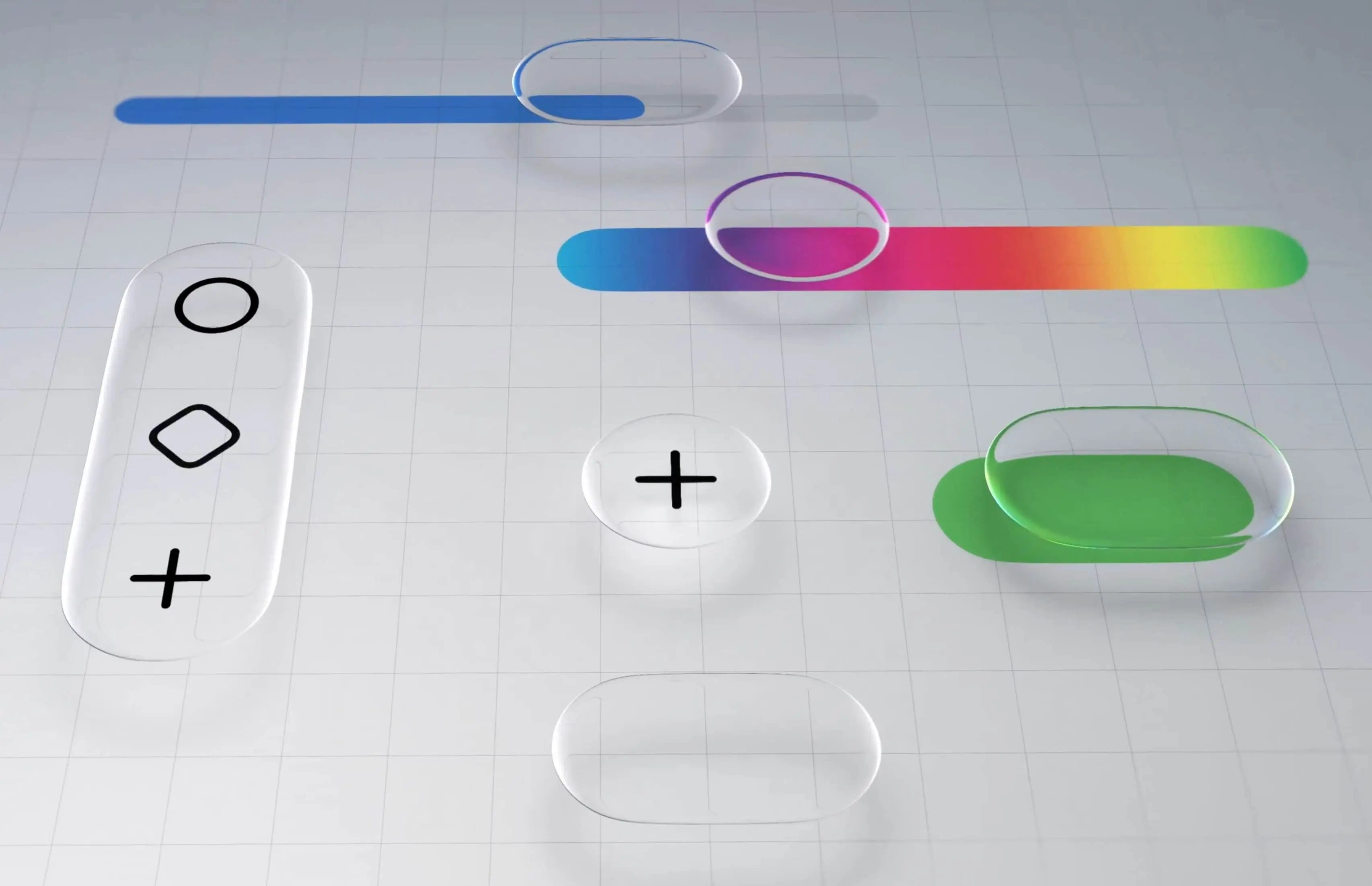
Hardik Pandya shared a thoughtful and informed critique of Apple's new visual interface style, which the company presented at WWDC25.
He recalled that Apple's design has always relied on "first principles": physics, metaphors, and UX patterns. Their design has always felt not just beautiful, but believable and appropriate. For example, skeuomorphism helped people navigate the first iPhones using metaphors, while flat design focused on clarity, readability, and lightness.
Hardik claims that in the case of Liquid Glass, this tradition has failed. For example, according to the company, the "glass" design brings the content closer to the user, but this metaphor works exactly the opposite. In the real world, glass is almost always an obstacle (showcase, aquarium, glasses, window), so the contents of the phone now seem detached.
The main thoughts from the article:
Liquid Glass creates a visual barrier where it wasn't there before
The redesign was carried out for the sake of consistency with VisionOS. This suggests that the unity of the design has become more important than the convenience of interacting with it.
The technical performance of Liquid Glass is really impressive, but it does not add functional value.
The introduction of a new style will require significant costs on the part of designers and developers, but in return they will not receive any benefit.
Over time, the new style can be refined, and it will become more convenient and familiar.
Field Notes From Shipping Real Code With Claude
The author shares his experience of vibe coding using the example of working with Claude. He identifies three types of collaboration with AI:
Playground Mode is suitable for experimentation and saves a lot of time. It's enough to describe the idea, and Claude will write the code himself so that you get a raw prototype.
Pair Programming is ideal if the project is created for real users, not for testing ideas, and it contains no more than five thousand lines of code. In this mode, the AI needs to be checked and guided by making a cheat sheet for it — CLAUDE.md . Any rules and commands that the AI is guided by are added here.
The Production/Monorepo Scale is suitable for large code bases, existing systems where every mistake can be fatal. Vibe coding needs to be applied very carefully and iteratively here, limiting AI at every step.
The main thoughts from the article:
The most important thing in vibe coding is code testing. It cannot be trusted by the AI, because it may miss a critical issue. Also, AI should not touch database migrations, security-critical code, API if different versions of it are not saved, and product settings.
Don't save tokens by reducing the context. It's like trying to save money on gasoline by filling the tank only half full and making more trips to the gas station because of it. Instead, it is better to give the AI not a minimal, but an exhaustive context.
One task is one session of dialogue with an AI. Otherwise, the AI will get confused in the answers.

The author explains how models learn and examines the three main stages of learning.
Pre-school without a teacher. The model reads huge texts, such as books or code, and learns to predict the next word.
Fine tuning. They use examples of the "perfect answer question", among which there are biased and formulaic ones. For example, Figma used untested projects from free access to train its model. Therefore, Figma AI can produce template results. When AI is trained by experienced designers on proven projects, the quality of the generated design will improve.
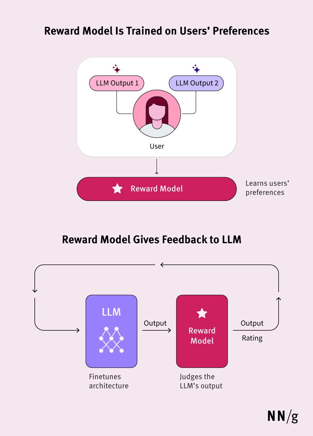
Learning with human feedback. The model generates response options, and people rank them. Based on the estimates, a "reward model" is built, which is a guideline for the main model.
The AI's responses are evaluated by people with their own biases, which strongly influences its behavior. This is important for those who design AI products, such as a chatbot on a website. In addition to the product team, AI responses should also be evaluated by real users.
Unlike search engines, a AI generates a response based on statistical information that it has learned during training. The model selects words based on the principle of probability, rather than extracting an answer from an existing database. Hence the so-called "hallucinations" of the models.