Issue 159
Multi layered pizza index


Hello, dear readers! 👋
In this issue, among other things:
How to improve the UX of notifications
What could the calendars of the future look like
Really working landing pages of tools for developers
A fascinating post about how the design of the macOS settings panel has changed
How digital displays work
Gorgeous covers of a fictional magazine about Minsk
Acid bar branding
…and much more!
Enjoy reading!
🗞 News and articles
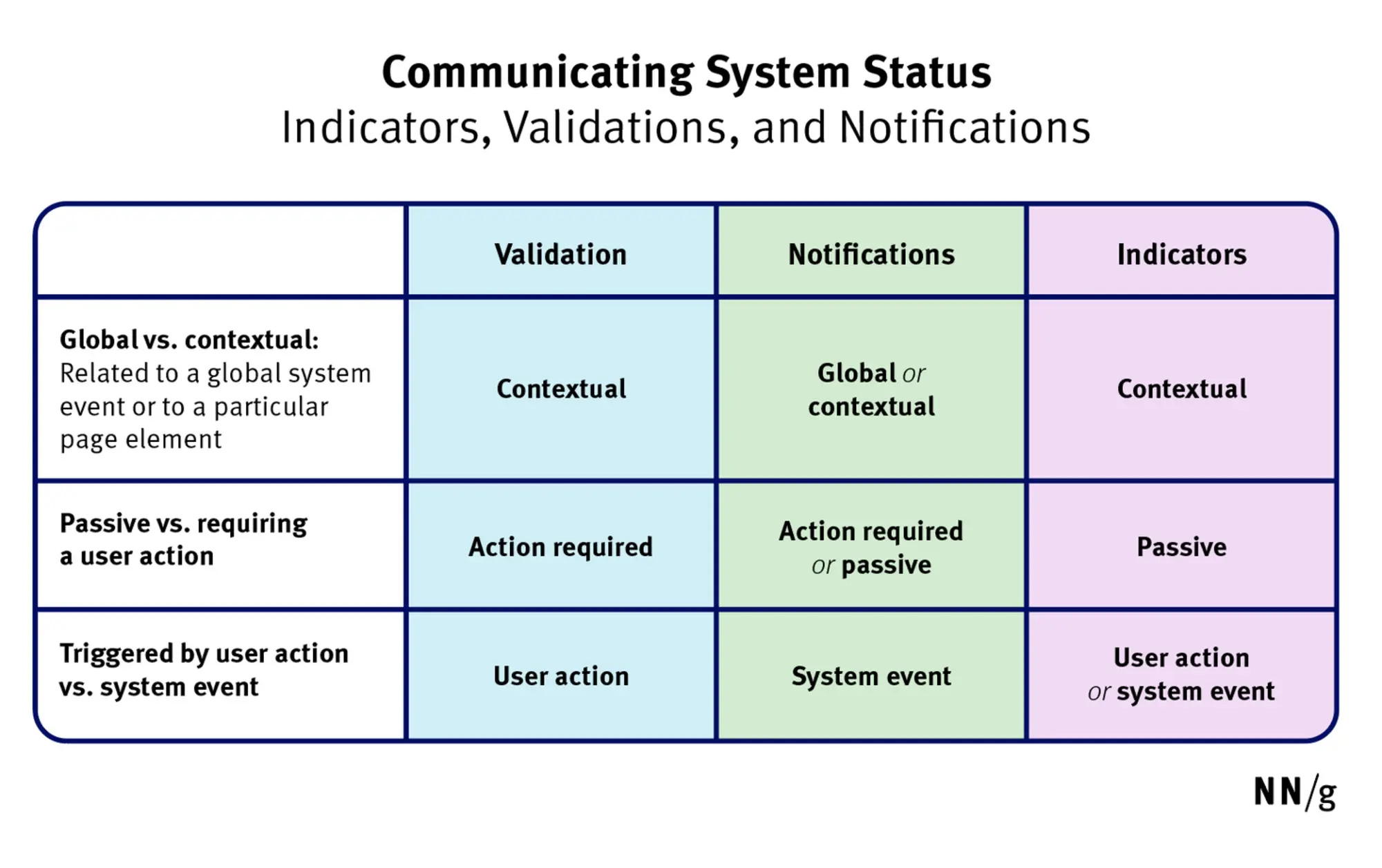
Design Guidelines For Better Notifications UX
Vitaly Friedman wrote about notifications and how to improve their UX:
Too frequent notifications are the most common complaint in usability tests.
The level of attention to notifications depends on their nature. For example, the user will respond to bank notifications or messages from friends faster than to push notifications about new app features.
A message from another person is always appreciated more than any automatic notification.
The more personal, relevant and timely the notifications are, the higher the engagement will be.
The fewer notifications a product sends, the higher the user satisfaction. Especially at the very beginning
For new users, it is better to set a low frequency of notifications by default.
Instead of a complicated list of notification settings, it's worth offering ready-made modes. For example: "quiet", "normal" or "full"
If notifications are too frequent, then you can suggest a "summary mode" in which all messages arrive at one time in a list.
Notification settings can be made part of onboarding
In order not to disable notifications completely, offer the user a temporary shutdown for 24 hours or another period.
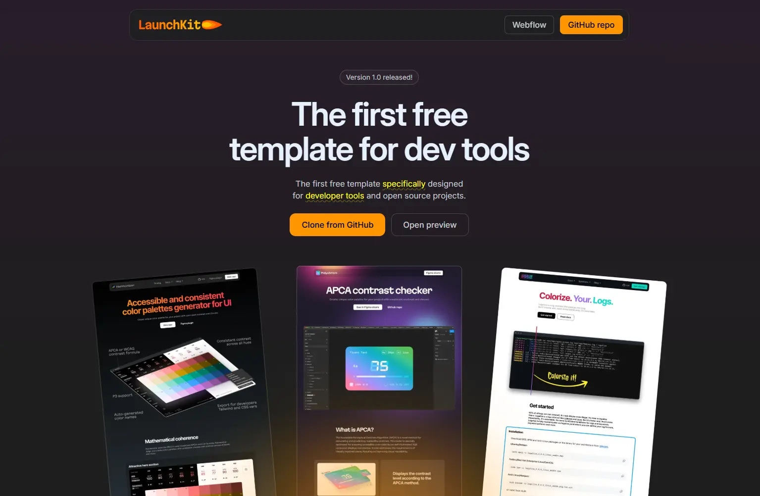
We studied 100 dev tool landing pages
"Evil Martians" studied 100 landing pages of developer tools and found out which ones really work. The article discusses in detail the features and purpose of each block.
The Martians also released an open-source landing template on GitHub and Webflow. It is based on the most working techniques obtained during the research.
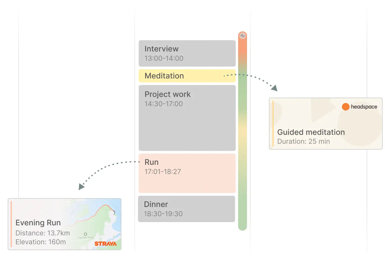
Julian Lehr wrote an essay about what calendars of the future might look like. He suggests starting to consider the calendar not just as a planner, but as a powerful tool with which we manage our lives, make decisions, and reflect on what has happened.
Lehr analyzed current productivity monitoring tools and identified four main types: notes, mail, task manager, and calendar. If you look closely, these directions intersect. Notes are just letters to the future self. Emails are tasks. Tasks are calendar events. Thus, the grid of calendar events should not be two-dimensional, but three-dimensional and multi-layered.
As a solution, Lehr proposed creating a new "multi-layered" calendar in which data would be added manually and automatically. It will be possible to "overlay" meetings, trips, tasks, as well as data on sleep duration and even the music you listened to.
Such a calendar will become a powerful thinking tool with which you can "travel through time", analyze your schedule and condition more accurately, and most importantly, make more accurate decisions. For example, you can compare work meetings and your heart rate schedule to control stress and prevent it in the future.