Issue 20: Product designer: How to master the profession
Special edition: Product designer. How to master the profession and be the one, the good one!

Hello, dear readers! 👋
This is the second special issue edition where I focus on the specific profession related to dev or design and I'd like to make this 20th issue available for everyone, so enjoy!
In the new part, we will talk about the profession of a designer of digital products and their interfaces — a product designer. This profession can also be found as the "interface designer", "UX designer" and "UX/UI designer".
Some of the materials in this issue intersect with the topic of web design and if you have already read the special issue about web design, you may notice repetitions. This is normal, I just wanted each special issue to be self-sufficient.
In this issue, among other things:
Best books for product designers
A large selection of articles
Some materials about the history of interface development
Portfolio of studios and individual designers
Collections of various tools and assets
A product designer is a specialist who is engaged in the design and development of a digital product. Its main tasks are to make the product as efficient as possible for business and convenient for the end user.
In different companies, the boundaries of the role of a product designer may vary markedly. Just because of the blurring of terms. In general, the product designer is responsible for the logic of the interface, its functionality, and aesthetics. But its main tools are: UX research, prototypes and tests, analytics data. Without them, it will not be possible to effectively solve the tasks of users and businesses, no matter how beautiful the interface may be.
What should a product designer pay attention to:
Fundamental design principles
Features of information perception and psychology
UX research and design methodologies
Prototyping
Accessibility standards
📚 Best books for product designers
"About face: The essentials of interaction design" by Alan Cooper, Robert Reimann, David Cronin, Christopher Noessel
"The Inmates Are Running the Asylum: Why High-Tech Products Drive Us Crazy" by Alan Cooper
"The Humane Interface: New Directions for Designing Interactive Systems" by Jef Raskin
"Designing Products People Love" by Scott Hurff
"100 Things Every Designer Needs to Know About People" by Susan Weinschenk
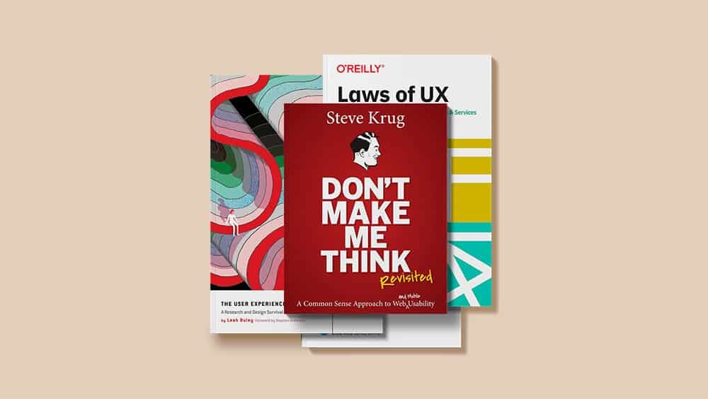
"Don't make me think" by Steve Krug
"Grid System in Graphic Design" by Joseph Muller-Brockmann
"Elements of User Experience" by Jesse Garret
"Getting Real. The smarter, faster, easier way to build a successful web application" by Basecamp
"Shape Up. Stop Running in Circles and Ship Work that Matters" by Ryan Singer
"The Best Interface Is No Interface: The simple path to brilliant technology" by Golden Krishna
"Refactoring UI" by Adam Wathan, Steve Schoger
"The Elements of User Onboarding" by Samuel Hulick
"User Friendly: How the Hidden Rules of Design are Changing the Way We Live, Work & Play" by Kliff Kuang
"Microcopy: Discover How Tiny Bits of Text Make Tasty Apps and Websites" by Niaw de Leon
🗞 News and articles
Which UX Research Method to Use
Lena Borodina talks about the framework for choosing UX research methods depending on its life stage, your tasks and resources. The article provides a step-by-step diagram with questions that help make the right choice.
Which UX Research Method to Use
Top 20 methods of UX/UI research from NNGroup
Analysis of when, how and which methods of user research are best used. As a reminder, you can save a map on which the methods are distributed along the axes "investigate attitude / investigate behavior" and "quantitative / qualitative". Plus, the context in which the method is applied is specified.
The article also examines what methods are used at what stages of development, and what questions they can answer.
When to Use Which User-Experience Research Methods
21 methods of UX research: when to use which
A large overview of techniques and tests for testing UX solutions. The author of the article describes their differences, pros and cons, and also talks about their convenience, the results obtained, the complexity of implementation and groups research by the stages of development at which they are used.
21 methods of UX research: when to use which
A selection of 10 articles about the key principles and approaches that help build good and useful products. It is framed in the form of a manifesto, which you can subscribe to. At the time of publication, it was signed by more than 3,200 people, among whom there are many industry tops.
A "blasphemous" article about the rejection of the grid in web design. About the origin and history of the grid: how it came to web design, what limitations and disadvantages it has in the context of adaptive design, how to move away from its use and what advantages such a refusal gives.
Three important thoughts from the article:
The layout should not change due to the size of the device. It should change due to the fact that the content does not fit the current layout
Designers should think of containers in terms of % of the parent container it occupies, not in terms of the number of grid columns
One of the best ways to achieve a beautiful layout is to have a set of reused variables for indentation between elements.
An interactive long article by Obys Agency about the basics of graphic design, this time about grids, their types, applicability and when they can be neglected. At the end there is a list of recommended literature.
Previous articles: about the principles of typography, about combining colors.
Good product designers / bad product designers
Laurent Grima cited two dozen habits and behaviors that distinguish good designers from bad ones. He writes in the context of product design, but in fact these habits and behaviors are applicable to any field of design, and other creative professions too.
For example:
Good designers know that finding a good solution requires a lot of attempts. They try different options, mix and try again and again. They try until they investigate the problem deeply enough. Bad designers stop at their first idea and show ill-conceived solutions
Good designers have a deep knowledge of theory, fundamentals and tools and apply them with all rigor. But good designers are not dogmatic, because they understand the basic principles of practice. Bad designers want to follow the only familiar process, no matter what
Good designers understand that design is a team game. They strive to get feedback as early as possible from all the right people. They listen to other people's ideas. Bad designers are afraid and keep their developments to themselves until the last minute. Bad designers feel threatened when other team members offer their ideas
Good product designers / bad product designers
How to include animation in your design system
Article by Caleb Barclay— a design consultant who helps companies design design systems. He gives detailed instructions on the description of animations, as well as tells why for animation, as for other components, repeatability, time saving and UX consistency are important, why it cannot be excluded from the general system, how it affects UX and other subtleties.
5 steps for systematizing motion design
A guide to Motion Design principles
This one is not just another analysis of the principles of Disney animation, but a detailed overview of the rules and techniques for creating meaningful interface animation. With examples and explanations.
A guide to Motion Design principles
Article on the Laws of UX website, the author of which has collected in one place the laws and effects of human perception that directly affect the design of interaction.
7 UX Laws You’Re Probably Getting Wrong
A great article by Ben Moss, in which he debunks typical misconceptions and misinterpretations of the laws of UX.
Let 's briefly list the seven laws analyzed and errors in their interpretation:
Jacob's law. Yes, people like similar and familiar interfaces. But novelty promotes positive emotions and good memorization
The gradient of the goal. Yes, the closer we are to the goal, the stronger the desire for it and the higher the probability of achieving it. But designers don't know for sure what a person's goals are, and they make the mistake of replacing a person's goal with a business goal
Miller's law. Even if people can hold only 7±2 elements in the head at the same time, this does not refer to the things displayed on the screen. Show all 12 navigational menu items if you have that many
The effect of aesthetics in usability. Yes, people find more beautiful an more convenient. But this does not mean that beauty is enough to make the interface convenient. This law cannot justify thin gray text on a gray background
The rule of the peak and the end. Yes, the overall impression is based on the peak and the end. But in the case of websites or interfaces, it is impossible to predict the beginning, peak and end of a particular user's route
Fitts' law. Yes, the accuracy of hitting the target is inversely proportional to the distance to the target and squared to its size. But in the desktop interfaces, with a mouse, aiming error is easy and quick to fix. And in mobile interfaces, the distance to the goal does not matter, it is the same all the time
Occam's razor. This philosophical principle says that, other things being equal, one should choose what is based on fewer assumptions. But not the easiest solution, and not the most obvious, as is often confused
7 UX Laws You’Re Probably Getting Wrong | Webdesigner Depot
A series of articles about the most common misconceptions in the field of user experience with clear explanations of why they are not true.
For example, such myths are debunked:
The main page of the site is the most important page
Sites need to be redone periodically
The design must be originalPeople don't scroll pagesThe page should be accessible in 3 clicks
People read on the Internet
UX Roadmaps: Definition and Components
NN/g on UX roadmap - a high-level artifact that helps prioritize and coordinate the tasks of the design team. A useful application article, techniques from which can be easily integrated into your process.
UX Roadmaps: Definition and Components
Guiding Principles Behind the Readymag User Interface
Stas Aki spoke about the fundamental principles that help the Readymag team in developing the interface of its own platform.
The main principles:
An interface is a communication that consists of how you perform tasks with a product and how it reacts. Therefore, it is good when the controls visually convey the essence of their function
The interface should be understandable without outside help and report any changes. Avoid unnecessary clutter and use only functional elements
A good interface is familiar and reliable. The system should not lose information or the result of the user's work, it should be able to restore data
The interface design should be aesthetically pleasing. This will convince the user that the product is reliable and can be used for a long time.
Simplicity is one of the most important principles. Feel free to sacrifice some of the features for the sake of simplicity. However, it should be designed, not random. It is important to facilitate the process, not to restrict the user
The Guiding Principles Behind Readymag User Interface
A test to determine the "UX maturity of organizations" from Nielsen Norman Group. It covers metrics such as processes, design, research, leadership support, and durability of UX solutions.
They also publish detailed analyses of each of the stages and what to do on them. Here's about the first one — the absence and ignoring of UX in the company. There is a test that will help you understand what level of maturity your organization is at.
Accessible design from the get-go
Roman Shamin from "Evil Martians" wrote about 20% of the designer's efforts, which give 80% of the availability of on-screen interfaces. A very good applied article that everyone should read.
Accessible design from the get-go—Martian Chronicles, Evil Martians’ team blog
Everything I Know About Style Guides, Design Systems, and Component Libraries
An applied article by Lee Robinson, in which he summarizes his knowledge of guides, design systems and component libraries.
Section names and their super short essence:
Why it's important: Speeds up the workflow
What is a guide: rules of visual design and illustration + style of communication and text
What is a component library: guides implemented in layouts and/or code, sets of elements that developers can use
What is a design system: a complete set of standards, documentation and principles, coupled with a library of components
Building a design system: examines in detail the different stages from assembling existing patterns to writing documentation
Everything I Know About Style Guides, Design Systems, and Component Libraries – Lee Robinson
84 cognitive biases you should exploit to design better products
A large review article on cognitive distortions in the context of digital product design. The article is very large, it is worth eating it in parts. But it's worth it, because there are a lot of specific interface examples.
84 cognitive biases that will help you design better-converting products
39 studies about human perception in 30 minutes
Kennedy Elliott talks on visualization methods and their human perception. She has prepared a summary of psychological research that helps to better understand what data visualization is, how different types of graphs and objects in them distort perception, on which axis it is easier for people to compare proportions, which types of graphs and diagrams are most effective, and much more.
39 studies about human perception in 30 minutes
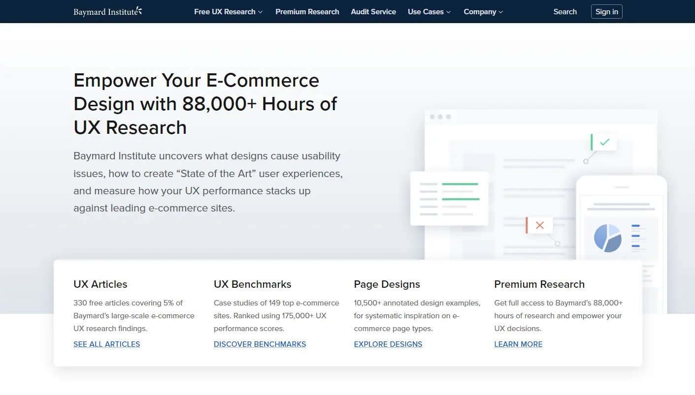
An independent organization that deals with UX analytics in the field of electronic commerce. The project team regularly publishes various research results, some of which are available for free.
Examples of publications:
10 solutions that will help to clearly show information about the size grid in online stores
Typical errors in the design of the payment method selection
4 mistakes that online stores make when displaying discounts on the product page
When Customer Journeys Don’t Work: Arcs, Loops, & Terrain
Stefan Anderson's gorgeous long article about replacing the CJM methodology for complex nonlinear products — arcs, loops and terrains. He borrows these terms and mental models from game dev and adapts them to the field of product design.
When Customer Journeys Don’t Work: Arcs, Loops, & Terrain
⚡️ Briefly
NNGroup has collected materials about the career growth of a UX designer that will help beginners and experienced professionals. Inside there are articles and videos, as well as the results of a study in which 722 UX specialists from around the world participated.
Growing in Your UX Career: Study Guide
Journey Mapping 101. Fundamentals of designing CJM "user travel maps" from NN/g.
🧘 Inspiration
Interfaces
Studios whose work you can take amazing examples from:
Some world-class designers:
A showreel of the American Fantasy studio, in which the guys showed their most interesting cases. Inside there are a lot of amazing UI solutions, spectacular interface animations and projects for the most unusual products. For example, among the projects you can find an interface and an animated dashboard for Tesla. It turned out to be a rather unusual, but impressive presentation.
Humbleteam. An agency that develops the design of digital products and applications. Separately, I would like to note the design of the block with works on the main one. Usually this is a tile with heterogeneous pictures, but here the guys have drawn an illustration for each project in their own corporate style, and it looks cool and fresh.
Humbleteam is a digital product design agency, award-winning but humble
INTERFACE LOVE. A collection of interfaces from movies and games broken down by category.
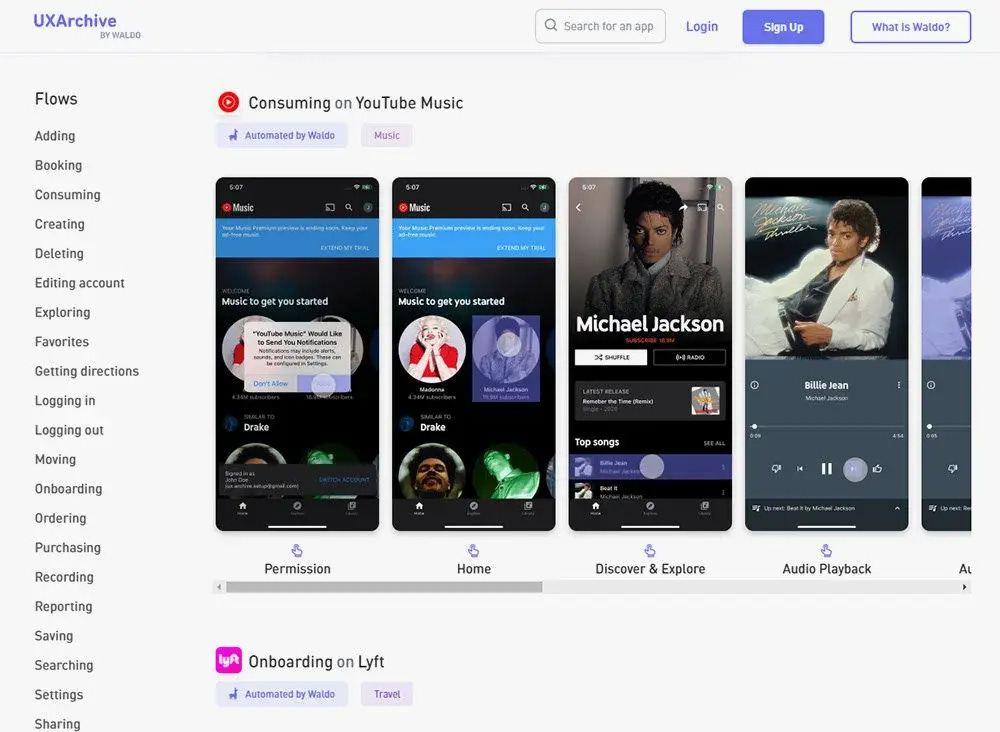
UXArchive. A large collection of screenshots with examples of successful user flow in mobile applications. In total, 1000+ examples from 150+ applications are collected on the site, and there is also convenient navigation through the categories.
Mobbin. A collection of inspiring and useful application examples. There are more than 100 thousand screenshots available on the site with search by categories, names, colors, types of elements and other parameters.
Browse iOS Apps | Mobbin - The world’s largest mobile app design reference library
📜 History of design
Version Museum. An online archive where you can trace changes in the design of popular websites, applications and operating systems since their appearance. For example, you can view the history of Amazon, Apple, YouTube, Facebook, Google and other products.
Version Museum: A Visual History of Your Favorite Technology
Web Design Museum. Electronic Museum of Web Design. Carefully preserves all versions of popular sites, starting from the earliest.
Web Design Museum 1991 â 2006
Mobile Phone Museum. Online museum of mobile phones, from the ugliest to luxury. Now there are 200 different brands in the catalog of 2000+ devices.
Endangered Sounds. An unusual nostalgic audio museum, which contains the sounds of old digital products and equipment. For example, the sound of a new message in ICQ, rewinding a cassette or turning on a computer from the 90s.
🎓 Education
Free courses and Youtube channels on Figma:
The official Youtube channel of the Figma team with tutorials on Figma and FigJam. Also on the channel there are reviews of new features, broadcasts and recordings of offline conferences
A large selection of Figma lessons from the Mizko Youtube channel
Beginners guide to Figma from Jesse Showalter
Anything & Everything Figma by Arnau Ros
Readymag Design Almanac. An educational project of the Readymag platform for web designers. The authors have prepared beautiful multimedia longrides about typography, grids, color and animation.
UX Courses. A large selection of courses on UX design, prototyping in Framer, Figma and ProtoPie, animation in After Effects, as well as launching applications using React, SwiftUI, Flutter or Webflow and other topics. Some of the courses are available for free. The price of the pro-tariff is from $19 per month.
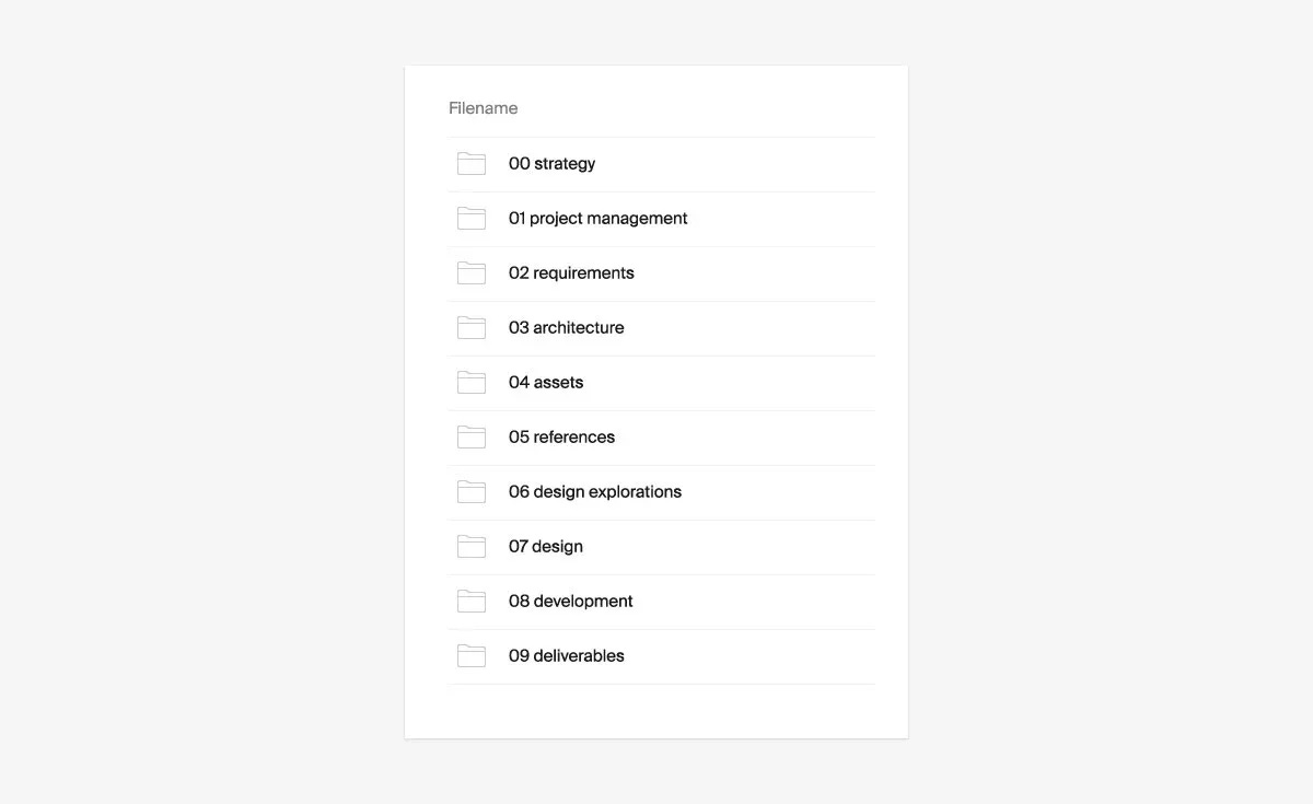
The team of the design agency AREA 17 told about how their internal processes are arranged. The material describes tools, file storage system, grids, drawing methods, fonts and typography, technical requirements, the process of transferring design to development and other details. Many techniques can be dragged into your own system of work.
Design techniques — Guides — AREA 17
⚙️ Tools
Let's briefly list the most popular tools of a modern UX designer:
Sketch (mac OS only)
After Effects (for animation)
Affinity Designer (analogous to Photoshop)
Photoshop and Illustrator (for graphics and illustrations)
The 2021 UX Research Tools Map. A map of 100 main services and tools for UX research, spread out by application areas.
The 2021 UX Research Tools Map
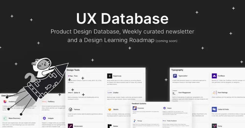
The Product Design Resources & Tools Database. Curated library of materials and tools for product design. Three dozen categories of materials alone.
Product Design Tools | UX Database
Let's briefly list the main sources of files for work. Both paid and free.
Large sites with different assets:
UIHUT. A marketplace with a variety of sources for designers: templates for websites and applications, sets of graphics, illustrations, icons
UI Store. A library of templates and illustrations for creating websites and mobile applications. Available in Sketch, Figma, Adobe XD, Illustrator and Photoshop formats
A network of Sketch Elements, Figma Elements, Adobe XD Elements and Framer Elements websites. A large curated source library in formats for the listed editors. Icons, design systems, mockups, illustrations, interface graphics sets, plugins
Images:
Death to Stock. High-quality photos and videos by subscription
Shutterstock. The largest photo stock. But expensive one
Unsplash. The most famous stock of free photos
Openverse. Search for free images. The search engine database already has more than 600 million images under the CC license
RAWPIXEL. Vintage stock of photos and illustrations with CC0 license. You may copy, modify, distribute and use stock images for commercial purposes. Permission is not needed
Artvee. A search engine for classic paintings in the Public Domain status. It can be downloaded in high resolution. Like Unsplash, but for fine art
Illustrations:
Storytale. Catalog of vector and 3D illustrations for the web from the Craftwork team.
Mockups:
Mockup.maison. A huge store of high-quality mockups created from live photos
The Templates. A store of high-quality mockups made on the basis of photos of real advertising media, mainly European
Porter Packaging. Realistic mockups of packages, boxes, paper envelopes and tape from a New Zealand company that produces packaging
Mockups design. A great resource with realistic mockups for the presentation of identity, web design, prints for clothes and much more.
Icons:
Flaticons. A popular online library of static and animated icons in PNG, SVG, EPS, PSD and CSS. There are paid and free
Remix Icon. 1300+ free open source icons. The icons are drawn on a 24×24 grid, each in two styles: lines and filled. SVG, JPEG, PNG and Web font formats
Iconer. A huge online library of 32,000+ customizable vector icons. A search is available on the site with grouping by style, fill type, tags and licenses
Tabler Icons. Collection of linear icons with thickness adjustment
Iconoteka. A set of 1000+ detailed SVG icons from Oleg Turbab. On the website, you can choose the version with or without fill, as well as adjust the thickness of the lines. The collection is periodically updated and updated
Customer Journey Builder. A simple free online service for creating a customer's travel map (COM). The application does not require registration. The finished maps can be exported to PNG or CSV.
Mockplus. The incredible design harvester comes from China. In one platform, developers have combined almost the entire process of digital product design: planning and documentation, tasks, userflow, interactive prototypes, visual design, design systems and the transfer of design to developers. All this with joint work, of course.
The interface design falls a little short of industry standards and the best samples, but it is made at a very decent level. There are also advantages. For example, it is very convenient to create states of elements.
There is a free version with restrictions. The price is paid — from $6 per user per month.
Penpot. A browser-based tool for full-fledged prototyping and design. Like Figma, but completely free and open source.
Penpot | Design Freedom for Teams
ProtoPie. An advanced service for creating interactive and animated prototypes. Allows you to store personal, team and public libraries of interactions, as well as use ready-made templates and animations, export designs from Figma and much more. There is a free limited version. The price is from $ 67 per month per user.
Plugin for importing from Figma.
ProtoPie | High-Fidelity Prototyping for Mobile, Desktop, Web & IoT
Craftwork. A store of high-quality digital goods for interface designers. There are UX/UI whales, icons and fonts on sale, as well as a large number of 2D and 3D illustrations, mockups, presentation templates and a lot more.
Craftwork: UX/U kits, templates, vector and 3D illustrations
Mobile Design System Starter 2.0. A basic set of components for the design of a light and dark mobile interface, including native iOS and Android components. In the updated version, we added master components for inputs and buttons, reduced the number of layers, and also added support for Auto Layout and Variants.
Mobile Design System Starter 2.0 | Figma Community
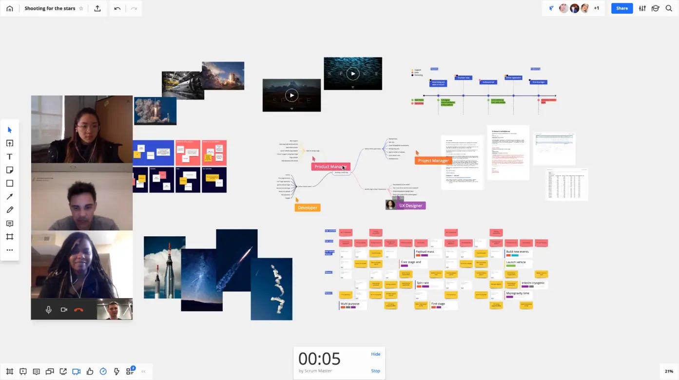
Miro. An advanced platform for mudboarding and team project management. Suitable for both small and large teams. Supports integration with Zoom, Google Docs, Figma, Sketch, ClickUp and other services, which allows you to work in almost one window. There is a free limited version. The price is from $8 per user per month.
The Visual Collaboration Platform for Every Team | Miro
Stay connected with Miro Apps & Integrations | Miro
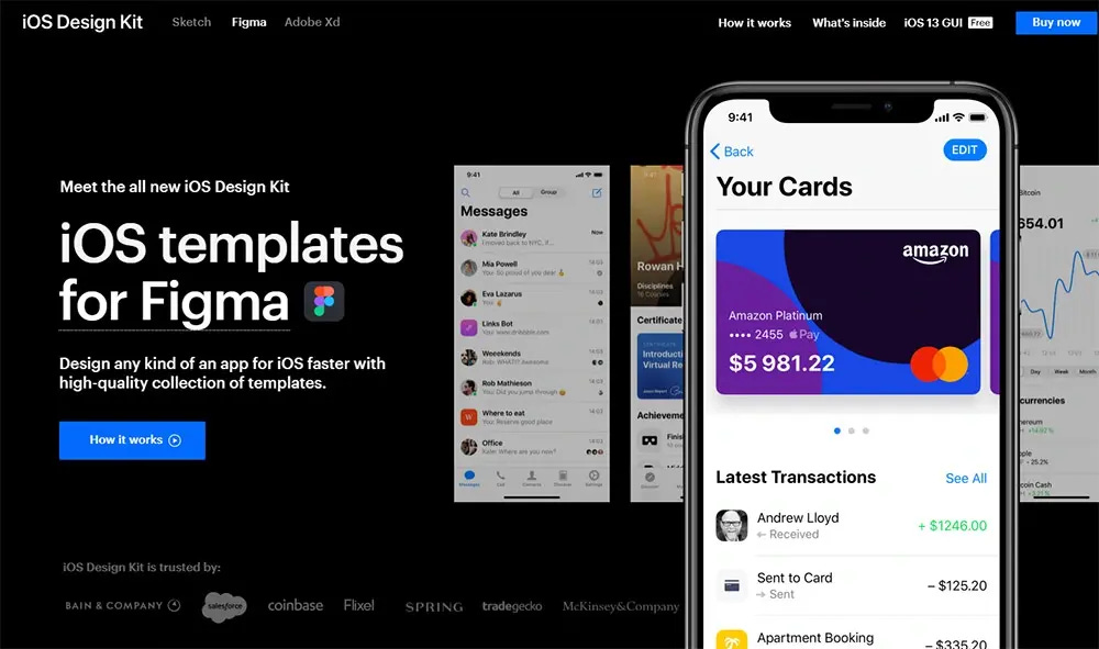
iOS Design Kit. A collection of native iOS components, as well as 185 ready-made screens for creating applications in categories such as: finance, fitness, education, news and many others. Available in formats for Sketch, Figma and Adobe XD. The price is $99.
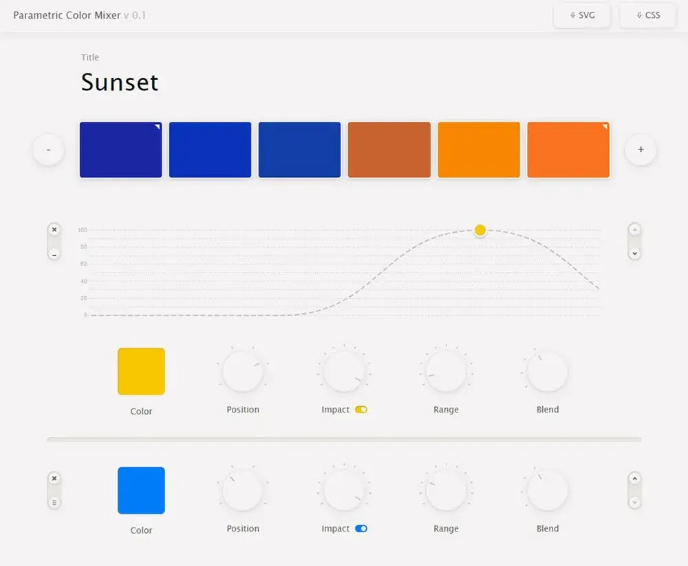
Parametric Color Mixer. A parametric color mixer in which you can create a gradation between two colors, and then mix additional shades. You can choose the blending modes and adjust the strength with which the color is applied. Export to SVG and CSS is available. The tool can be useful when creating palettes for illustrations or data art.
Easings. A visual service for checking the acceleration curve and animation speed on different interface elements.
And there is also a Cheat sheet on smoothness functions, which is also helpful.
Easings - Generate, test and share custom easing curves.
Bubble. A powerful no-code platform for launching adaptive web applications and websites. Supports integration with Figma, Slack, Mailchimp, Intercom, YouTube and many other useful services. There is a limited free version. The price is from $25 per month per user.
Zeroqode. A selection of templates for Bubble. The site has both ready-made templates and separate interface blocks, as well as PSD layouts, courses and plugins. For example, with the help of such solutions, you can inexpensively create a service similar to Trello. The platform also offers the opportunity to convert web applications purchased on the platform into native applications for iOS and Android.
Bubble Figma Integration. Plugin for integration with Figma. Transfers each frame as a ready-made application page, and converts the interface elements into the corresponding elements in Bubble.
The best way to build web apps without code | Bubble
Zeroqode is a Platform with No-Code App Templates, Courses, Plugins, etc.
Play. A service for creating mobile applications directly from your smartphone. Allows you to design applications from scratch, use a library of 100+ customizable components with different states, or import a design from Figma.
Eagle. A powerful cross-platform application for designers that helps to store and flexibly organize a library of references for inspiration. It allows you to store any type of files, embed and view videos without downloading, sort materials by color and type using smart filters, drag entire libraries from Pinterest and much more. The price for a perpetual license is $30. There is a trial for a month.
A selection of advanced icon managers:
Iconset. An application for Windows and macOS that stores your library of SVG icons. You can pick up icons by simply dragging and dropping them into Figma, Sketch, Photoshop, Illustrator or any other tool. The program has a search, a tag and folder system, synchronization with cloud services for teamwork
Icon Shelf. A free icon manager for open source web developers. Supports search, grouping by collections, file optimization, as well as fast copying in the form of code or SVG. Available for Mac OS, Windows and Linux
Norde. A free icon manager for macOS, Windows and Linux. It can batch edit colors, change the size of icons, export to the desired format and much more
Icon Jar. An icon manager for macOS. Supports mass export, SVG optimization, integration with Sketch and much more. There is a free trial version. The price is €30 for an annual license, and €70 for permanent
Nucleo. An icon manager for macOS, Windows. It allows you to create convenient collections, edit icons, fine-tune exports, copy code, share collections with the team, and much more. The price of a perpetual subscription is from $100 per user, or $300 for a team of 5 people
Glide. A constructor for creating websites and applications. Allows you to create a ready-made interface based on data from an excel spreadsheet, and then select the design using styles. For example, you can upload a table with names, prices and photos of products, and the platform itself will design a showcase in which you can customize the description and add buttons. There is a free limited version. The price is from $25 per month. Video presentation
Glide • No Code App Builder • Nocode Application Development
Directual. No-code is a platform for launching websites and full-fledged web applications. Supports integration with third-party services via the API, working with databases, collecting statistics and much more.
A recent update added functionality to launch full-fledged Web3 applications. Now the platform supports such necessary functions as transaction management, decentralized authentication, integration with MetaMask, wallet management and much more.
There is a free limited version. The price is from $30 per month.
Directual - Product Information, Latest Updates, and Reviews 2022 | Product Hunt
Shortcuts.design. Online cheat sheet on hotkeys of popular software for designers and developers.
Every shortcut for designers, centralized and searchable
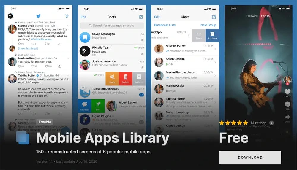
Mobile Apps Library. A set of 150+ screens of popular social networks in formats for Sketch and Figma. Telegram, Instagram, WhatsApp, FB Messenger, TikTok and Twitter layouts are available.
Mobile Apps Library for Figma & Sketch App
ArchetypeApp. You can select fonts, manually adjust the base coefficient and line height. The results are worse for my taste than the previous one. But you can make styles immediately for the mobile version.
Icons8. A huge ecosystem with AI tools and various assets for designers. The price of subscriptions to individual services with a discount is from $13 (without a discount — from $24). Single subscription for all products (except Mega Creator) with a discount — $29 (without a discount — $89).
Best products:
Icons — icon library
Moose — photostock
Fugue — music stock
Lunacy — a free graphic editor that understands the Figma and Sketch formats
Background Remover — An AI service for removing background from images
Smart Upscaler — an AI service for increasing the resolution of images
Generated Photos — 2.6 million faces generated by artificial intelligence that can be safely used. Here is also a real-time generator
Mega Creator — designer of 2D and 3D illustrations
Free Icons, Clipart Illustrations, Photos, and Music
🅰️ Fonts
Google Fonts. A huge font library where you can find any fonts for different tasks. The site has a convenient sorting and preview. Fonts from this library can be used for free in personal and commercial projects.
Also, Google Fonts recently released a large library of 2500+ customizable icons, which are available as a special variable font. You can customize the fill, thickness, stroke and size, as well as customize the visual weight for different scales or dark themes. Icons are also available in a plug-in for Figma.
Material Symbols and Icons - Google Fonts
Introducing Material Symbols - Material Design
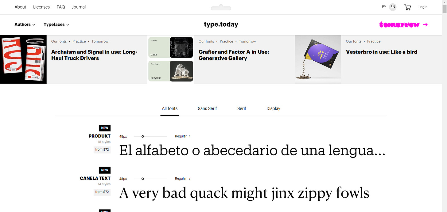
Type.today. The font shop of Ilya Ruderman and Yuri Ostromentsky. The store has two "showcases": today and tomorrow, where you can find a lot of high-quality fonts from young or long-known authors.
The Temporary State. Roman Gornitsky's font studio, in whose collection you can find excellent antiques and grotesques.
🍪 Desert
Portfolio of industrial designer Jake Lee from Seoul.
Dig into the huge archive of drawings revealing the complex root systems of 1180 plants. Drawings of root systems of different plants.
📱
To follow for the newsletter updates, questions or just keep in touch you can check journal's Twitter & Instagram
I'd soooo much appreciate if you share this newsletter to your colleagues on any of your social media❤️


