Issue 34: Kano model in the Solar system
A great overview of trends in font design; How to design a product feedback system; Gallery of 997 logos with convenient categories and so much more!

Hello, dear readers! 👋
In this issue, among other things:
A great overview of trends in font design
Detailed article about the Kano model for prioritizing product functions
How to design a product feedback system
Guide to the fundamental rules of design
Documentary about the "art factory" in China
Free browser-based watermark removal service
Free application for removing background and upscale images on Mac
Gallery of 997 logos with convenient categories
Structured guide for creating design systems
Quotes from "Invisible Cities" book by Italo Calvino
Enjoy reading!
📚 Book quotes
I suggest you to draw some attention to the book by Italo Calvino "Invisible cities" Here are quotes that will hopefully help you decide whether to read it or not:
Arriving at each new city, the traveler finds again a past of his that he did not know he had: the foreignness of what you no longer are or no longer possess lies in wait for you in foreign, unpossessed places.
The inferno of the living is not something that will be; if there is one, it is what is already here, the inferno where we live every day, that we form by being together. There are two ways to escape suffering it. The first is easy for many: accept the inferno and become such a part of it that you can no longer see it. The second is risky and demands constant vigilance and apprehension: seek and learn to recognize who and what, in the midst of inferno, are not inferno, then make them endure, give them space.
Cities, like dreams, are made of desires and fears, even if the thread of their discourse is secret, their rules are absurd, their perspectives deceitful, and everything conceals something else.
“You take delight not in a city's seven or seventy wonders, but in the answer it gives to a question of yours.
Memory's images, once they are fixed in words, are erased," Polo said. "Perhaps I am afraid of losing Venice all at once, if I speak of it, or perhaps, speaking of other cities, I have already lost it, little by little.
...the people who move through the streets are all strangers. At each encounter, they imagine a thousand things about one another; meetings which could take place between them, conversations, surprises, caresses, bites. But no one greets anyone; eyes lock for a second, then dart away, seeking other eyes, never stopping...something runs among them, an exchange of glances like lines that connect one figure with another and draw arrows, stars, triangles, until all combinations are used up in a moment, and other characters come on to the scene...
You reach a moment in life when, among the people you have known, the dead outnumber the living. And the mind refuses to accept more faces, more expressions: on every new face you encounter, it prints the old forms, for each one it finds the most suitable mask.
Falsehood is never in words; it is in things.
invisible cities in books | chapters.indigo.ca
🗞 News and articles
Visual design rules you can safely follow every time
Anthony Hobday has compiled a large selection of fundamental design rules, including tips on working with color, contrast, spacing, text and visual weight of objects. These rules can be broken if necessary, but even simply following them will make your design better.
Some tips from the article:
Do not use pure black or white. Instead, make it almost black and almost white
Align the elements optically, rather than relying solely on mathematical alignment
For a larger text size, reduce the distance between the letters and the line height, and for a smaller text size, increase them
Container borders should contrast with both the container and the background
If you saturate neutral colors, use warm or cold colors, not both at once
Count the margins between objects from high contrast points
The closer an element is to the viewer, the lighter it should be and vice versa.
Complex objects look better on a simple background, and simple ones on a complex one
The external indentation from the background to the object must be equal to or greater than the internal indentation between the objects
The main text must be at least 16 pixels in height
Product Reviews And Ratings UX: A Designer’s Guide
Vitaly Friedman writes about how to design a system of product reviews so that they bring maximum benefit to new users. He also talks about the value of negative reviews, which are often more informative and useful than positive ones, and that their absence can be a wake-up call.
The main thoughts from the article:
As a rule, customers are looking for honest reviews from people like themselves. Usually such reviews are negative
It is important to encourage users for honest and detailed reviews, even if they are negative
The absence of negative reviews may mean that the company is hiding problems with the service
A simple five-star rating system is not informative enough. It is necessary to show a more detailed result. For example, 4.6 instead of 4
It is very important to show the total number of reviews. Users often prefer the product with the highest number of ratings, even if the average score is lower
When the rating is too high, customers begin to suspect cheating. The optimal value is between 4.5 and 4.9
It is advisable to show a summary of reviews so that users can see the ratio of ratings. You can also show a summary of ratings for specific product attributes
Ask users if they would recommend the product to their friends
Allow users to mark useful reviews and raise such reviews higher. Also add sorting of reviews by date, usefulness and rating
Product Reviews And Ratings UX: A Designer’s Guide — Smashing Magazine
The Complete Guide to the Kano Model
Folding Burritos made a detailed material about the Kano model, which is one of the most common ways to prioritize product functions and attributes. He describes the origins of the model, and also shows the methods of calculations based on it.
The model is based on the works of Noriaki Kano, as well as William Shuhart and William Edward Deming. Its essence boils down to the fact that the product has objective and subjective qualities. Objective are all its functions and attributes, and subjective are the benefits and value for the user, which bring some objective qualities. When creating a product, it is important to focus on subjective qualities and, first of all, develop those functions that help in this.
We can spend an infinite amount of money on improving the product. But if we improve all the qualities at once, and not those that are important to users, we will not be able to sell our product. It will be more expensive to produce than its market value. Improving only the important qualities of the product is not a whim, and not altruism. This is an economic necessity.
The Complete Guide to the Kano Model | Folding Burritos
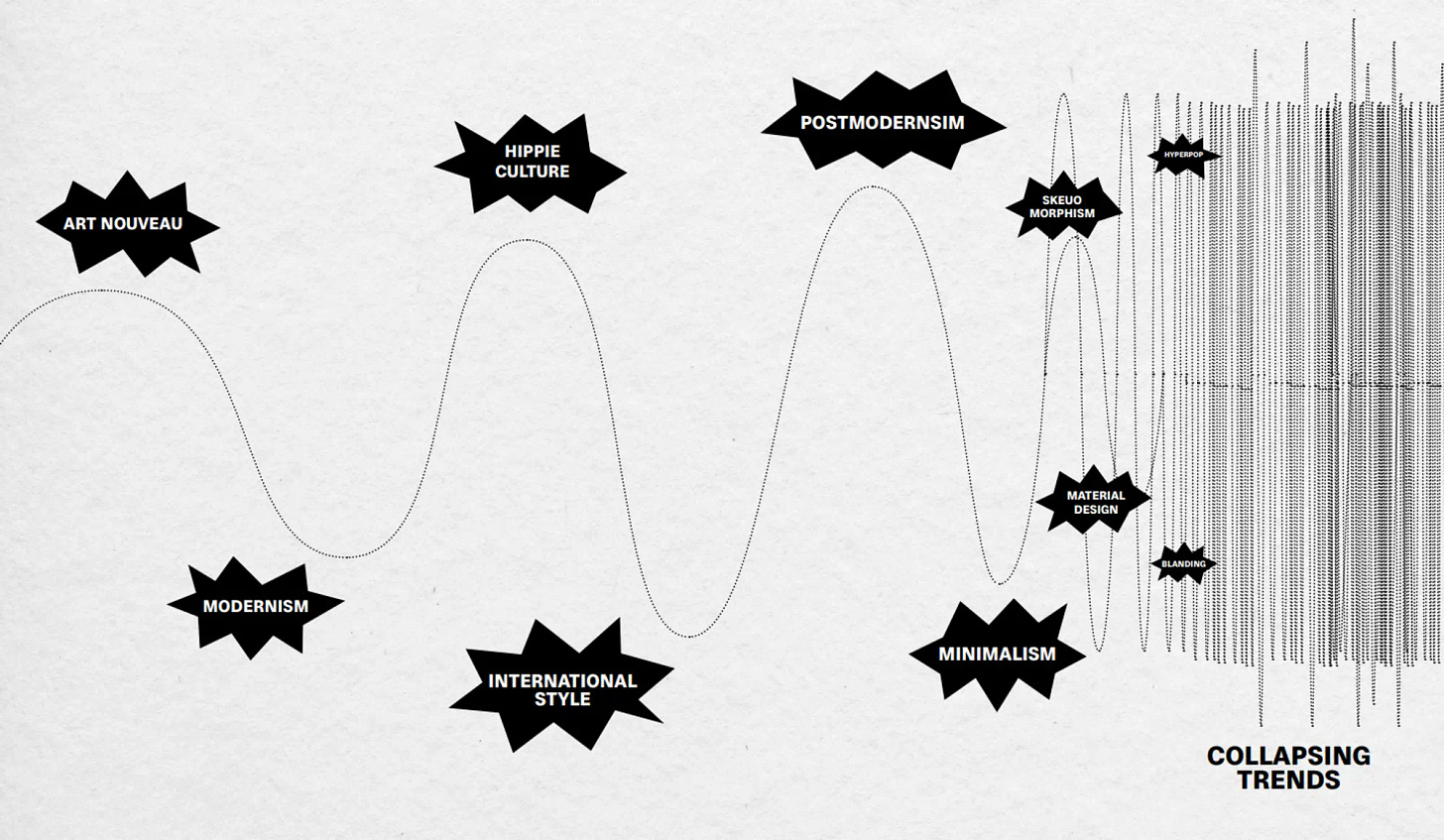
A large PDF report from the TypeCampus project, in which modern fonts and typography are examined in detail and with a large number of examples. Among other things, digital aesthetics, nostalgia, naturalness, meaningful design and a mix of styles are now popular. The authors also conducted interviews with various guests and collected their manifestos and reflections that will help systematize what is happening in modern design. In total, the report contains 300+ pages.
I also recommend reviewing the annual Monotype report.
The latest in type design, from the Monotype Studio.
⚡️ Briefly
Ivan Kilin gave 11 tips for developing diagrams for visually impaired users. They will help make charts more accessible with text, shape, and color.
11 tips for designing accessible charts for visually impaired readers
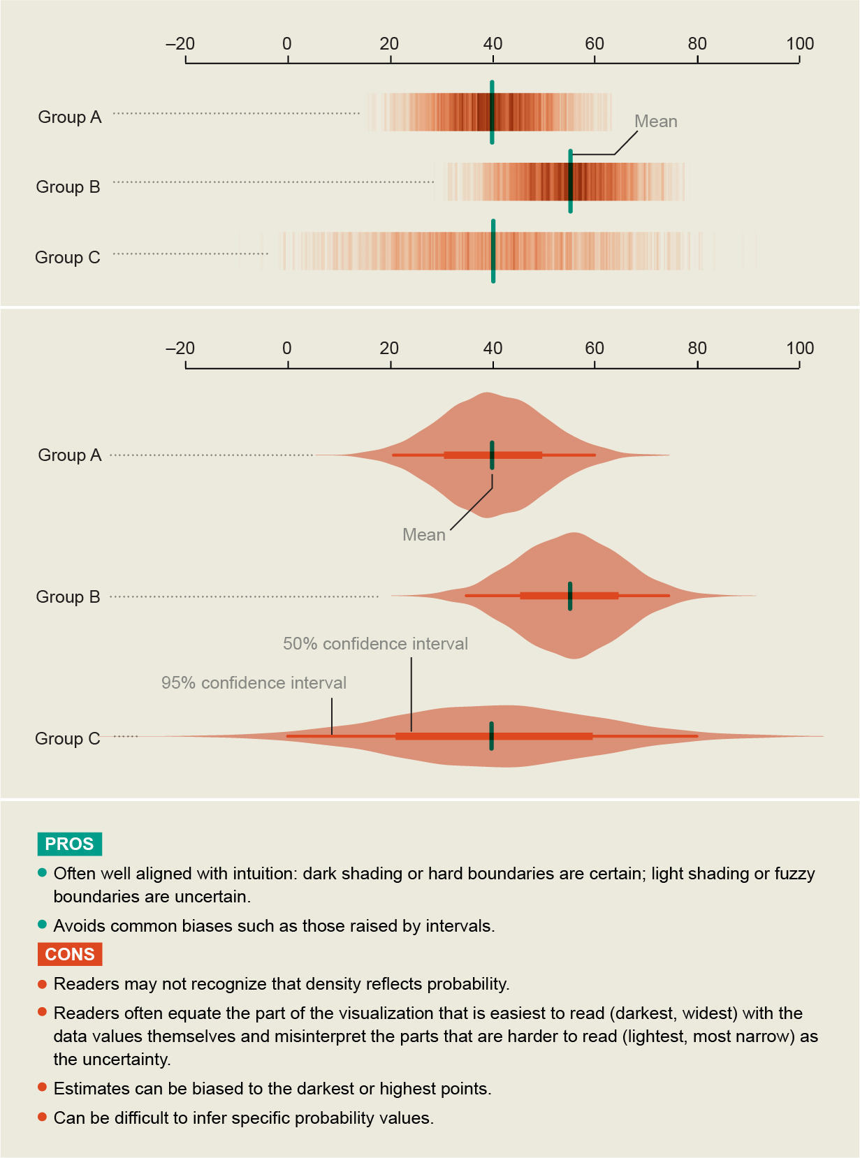
How to Get Better at Embracing Unknowns. Article by Jessica Hallman on how to study indeterminate processes using data visualization methods.
How to Get Better at Embracing Unknowns
New technologies
AI text classifier. OpenAI has released a free tool that recognizes text written by AI. So far, the developers advise using it only for English texts.
New AI classifier for indicating AI-written text
AI Test Kitchen. Google has opened pre-registration for those who want to test the new LaMDA chatbot. It contains 540 billion parameters, which is three times more than the current version of ChatGPT.
3D Avatar Diffusion. Microsoft has announced a 3D avatar generator that can create models based on photos and text. The resulting avatars can be customized. For example, it will be possible to change the length of hair or ethnicity.
🧘 Inspiration
Branding
Ultra-minimalistic identity of the cafe and coffee producer Spectrum. The authors used a utilitarian technological layout and color coding, which shows in which country the grains were grown.
Meati. A cheerful rebranding of a mushroom-based food manufacturer with a bright range and pleasant typography in the spirit of the 60s.
✍️ Typography, calligraphy and lettering
Used to the limit. An unusual series of postcards with a spectacular custom font at the base. On top of the cardboard, the authors pasted the initials of the recipient, which were cut out manually. Old boxes were used as the basis, so each postcard turned out to be unique.


