

Issue 39: Kilograms of sinograms
A large selection of news about the introduction of AI in digital products; How to correctly use empty states in the interface and so much more!

Hello, dear readers! 👋
In this issue, among other things:
A large selection of news about the introduction of AI in digital products
The structure of Japanese writing in simple language
A new approach to the description of the typography system
How to correctly use empty states in the interface
Why AI will Make Designers More Productive
Why is it important to describe component specifications in design systems
Step-by-step guide to using the Remix Mode function in Midjourney
A huge selection of font design resources
The winners of the world's first award for the best dashboard
Quotes from "Essentialism: The Disciplined Pursuit of Less" book by Greg McKeown
Enjoy reading!
📚 Book quotes
Today will be the quotes from the book by Greg McKeown "Essentialism: The Disciplined Pursuit of Less". Let them help you decide whether it's worth it:
Remember that if you don’t prioritize your life someone else will.
Essentialism is not about how to get more things done; it’s about how to get the right things done. It doesn’t mean just doing less for the sake of less either. It is about making the wisest possible investment of your time and energy in order to operate at our highest point of contribution by doing only what is essential.
You cannot overestimate the unimportance of practically everything.
What if we stopped celebrating being busy as a measurement of importance? What if instead we celebrated how much time we had spent listening, pondering, meditating, and enjoying time with the most important people in our lives?
The word priority came into the English language in the 1400s. It was singular. It meant the very first or prior thing. It stayed singular for the next five hundred years.
Essentialists see trade-offs as an inherent part of life, not as an inherently negative part of life. Instead of asking, “What do I have to give up?” they ask, “What do I want to go big on?
There should be no shame in admitting to a mistake; after all, we really are only admitting that we are now wiser than we once were.
Sometimes what you don’t do is just as important as what you do.
Today, technology has lowered the barrier for others to share their opinion about what we should be focusing on. It is not just information overload; it is opinion overload.
We can either make our choices deliberately or allow other people’s agendas to control our lives.
the killer question: “If I didn’t already own this, how much would I spend to buy it?
A popular idea in Silicon Valley is “Done is better than perfect.
Essentialism: only once you give yourself permission to stop trying to do it all, to stop saying yes to everyone, can you make your highest contribution towards the things that really matter.
two most personal learnings that have come to me on the long journey of writing this book. The first is the exquisitely important role of my family in my life. At the very, very end, everything else will fade into insignificance by comparison. The second is the pathetically tiny amount of time we have left of our lives. For me this is not a depressing thought but a thrilling one. It removes fear of choosing the wrong thing. It infuses courage into my bones. It challenges me to be even more unreasonably selective about how to use this precious – and precious is perhaps too insipid a word – time.
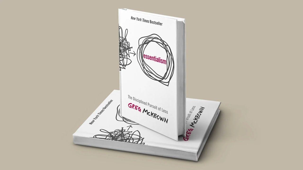
Essentialism - The Disciplined Pursuit of Less by Greg McKeown
🗞 News and articles
Japanese typography. Kilograms of sinograms
Emily Rigaud spoke simply and clearly about the Japanese writing system, which combines as many as four subsystems: kanji, hiragana, katakana and Latin writing, as well as about specific elements such as furigana and hentaigana.
She spoke about the origin of each writing system, and also explained how Japanese writing has changed with the development of technology and the transition to metal fonts.

Generative models are literally everywhere
We will probably remember 2022 as the year of the beginning of the AI era. Approximately like the presentation of the iPhone in 2007, we perceive as the beginning of the smartphone era, and the launch of Google in 1997 as the year of the beginning of the mass Internet. The Internet and smartphones were invented earlier, but by this year they had matured to a qualitative breakthrough. It seems to be the same story with generative neural networks.
In recent months, many startups have launched products with AI under the hood. Large companies are introducing AI technologies into existing products. And these announcements show that the new technology has the potential to change a lot of areas of work. In the picture, we have given a list of categories in the catalog of AI tools - these are those areas where there are already from 5 to 30 finished products. Of course, not everyone will survive, but the trend is obvious.
We are witnessing a qualitative change in our instruments, which will entail a qualitative change in ourselves.
Take a look at a number of the most notable and characteristic news about this recently, which I've selected:
Miro promised to use AI to generate code and sammari to texts, as well as create images based on a text query and generate branches of mental maps
Discord introduces ChatGPT-based features that will expand the capabilities of the Clyde bot and the AutoMod tool, as well as allow you to generate sammari dialogues in the chat
Grammarly presented a set of generative tools based on GPT-3
Stability AI has introduced the Stability for Blender tool, which allows you to use AI to create images, effects, textures and animations based on text descriptions right inside the 3D editor
The Type text editor generates a draft of the text, changes the tone of the letter, writes sammari and much more
Another text editor, Asterix, offers to "edit text as a photo" using the enhancement, crop/resize, filters, extensions and notes buttons
D-ID launched a chatbot with a generative animated avatar. Knows how to answer questions, tell news, recommend movies or books, and much more
The AI-Lawyer legal service provides consultations, generates, checks and explains legal documents "on the fingers"
Papercup translates and duplicates videos
Audyo creates voice acting based on text
Levity automates routine tasks. For example, it can sort emails and respond to emails, as well as update content in the online store.
The mind mapping platform Whimsical has announced the introduction of an AI assistant in its mental map editor
Professor of theology Ken Sandet Jones tried to use ChatGPT as a pastor-preacher

Matthew Ström explained why AI will make designers more productive rather than take away their work, and why it will help make design cheaper and more efficient.
He compares the emergence of AI to the "fly-by-wire" system in aviation, which automated the control of the aircraft, but did not replace the pilots. In the period from 1970 to 2019, the number of passengers increased by 1400%, which indicates an increase in the efficiency of airlines. At the same time, the number of pilots has increased by 27%, and their salaries remain at a consistently high level.
Matthew also explains that using sophisticated technology implies that you understand how these systems work and where they can go wrong. Therefore, it is important to become full-fledged experts in this field. Training in such design can take years, and you need to start now if you want to remain competitive.

Component Specifications. What to include, where it goes, and why...
Nathan Curtis spoke about the importance of creating component specifications in design systems, especially when working with multiple platforms and complex components, as well as in a large team environment.
He says that the standard inspector in Figma is good, but limited, and developers should not guess trying to figure out the designer's idea.
Nathan suggests creating a single specification file for all employees of the organization, which will describe the anatomy and properties of components, their behavior and animation, as well as availability, tokens and version history.

Sizing typography in design systems
Kevin Muldoon offers a new approach to the description of the typographic grid in design systems, which is better suited for adaptive layouts.
It focuses on the width of typical content columns in different states of adaptability. Kevin believes that this is a more practical approach than a fixed size classification, since it allows the designer to better control the size of the text depending on the width of the column in which it will be displayed.
The article presents specific formulas that can be used to determine font sizes.

7 types of empty states and how to use them
Kinneret Yifrah talked about what empty states are in the interface, what they are, and how to use them competently to tell the user about the product or paid functions.
7 types of empty states:
The user has not created anything yet. For example, did not add products to favorites. Tell us what needs to be done and add motivation. For example: "Save the book so you don't forget to read it"
The user didn't do anything to see the statistics. For example, there is no data on views because nothing has been published. Add a call button and explain what will happen next. For example: "Post a video to see the number of views"
The user has done everything, but it takes time to get the data. Explain how the system works and offer to come back later. For example: "It takes 24 hours to collect reliable data"
The user deleted all the data because this is the purpose of the process. For example, I closed all the tasks. In this case, you can praise him for his productivity. At the same time, you should not add any appeals
The user does not see the data because this feature is paid. This is a great opportunity to motivate him to increase the tariff. Show the value of paid features and tell us exactly how they can help
The search results are empty without filters. Offer to correct the query, show similar results, or inform that the information can be added later
The search results with filters are empty. Offer to remove some of the filters, show similar results, or promise to let us know when the necessary information or product appears
7 types of empty states and how to use them
⚡️ Briefly
JTBD Canvas 2.0. Jim Kalbach and Elaine Matthias have released an updated version of their template based on the "Jobs to be Done" methodology, which helps to identify the user's task and understand what product is needed to solve it. In their accompanying memo, they describe how to work with it.

Relative rounded corners. Set Studio has made a guide on how to use a formula to automatically synchronize the rounding of internal and external objects. Usually this adjustment has to be done by eye, selecting values so that the rounding of the inner object visually fits the shape of the outer one. Inside the article there are examples of HTML and CSS code, as well as a demo example for testing various values.

Relative rounded corners - Set Studio
How to use ChatGPT for UI/UX design: 25 examples. A selection of examples of the use of AI in the daily workflow of a designer.

How to use chatGPT for UI/UX design: 25 examples
New technologies
Microsoft announced the release of GPT-4 this week. The new version will be multimodal, which will allow you to translate text not only into images, but also into videos and music. GPT-4, like the previous models, will be integrated into Azure-OpenAI.

GPT-4 is coming next week – and it will be multimodal, says Microsoft Germany
Nick Stamas predicts the creation of a breakthrough neural network for designers from Figma. The thing is that the company has a unique data set of billions of real design layouts that can be used to train a neural network. A dataset is always the most important element in training models, and no one else has such a volume of data about digital design.
According to his forecast, the company may announce a new tool at the next Figma Config conference. This theory is supported by the fact that Figma actively hires specialists in the field of AI.
Spoiler alert: AI isn't going to take your design job.
But there's one company that's sitting on a hidden mountain of data that could radically change the way products are designed. The rest are likely vaporware or toys.
Here's my prediction 👇— Nick Stamas (@nickstamas) February 27, 2023
🧘 Inspiration
Branding
Modern rebranding of the American TV channel Freeform. The style is based on a rather bold visual technique with "inverted" curves, which is used to distort titles, logos, masks and patterns.

A stylish utilitarian rebranding of the Myers & Briggs Foundation, which deals with psychological testing.

The original rebranding of the Wise payment system with a custom font, a flexible modular system and unusual 3D illustrations with animated textures.

✍️ Typography, calligraphy and lettering
The original series of pseudo-vintage logos and lettering for the series "Hello Tomorrow!", which takes place in a fictional retro-futuristic world.

Hello Tomorrow! — the Design Office of Matt Stevens - Direction + Design + Illustration
Ohno. A wide range of classic and experimental fonts from a Californian type foundry.

🌁 Posters
A selection of expressive posters by Viktor Kovalenko with Chinese characters and typographic experiments.

Expressive and diverse posters by graphic designer and illustrator Braulio Amado.

🖨 Printing
Le livre de 1,8 livre. A touching book dedicated to the problem of premature birth. The book weighs 1.8 livres (880 grams), like a prematurely born child, and is wrapped in a cover that resembles a diaper for children. On the pages of the book, you can also monitor the change in the size of the baby's head during the period from 24 to 40 weeks of pregnancy.
The book is decorated with a pleasant modern layout with delicate colors and friendly cartoon illustrations.

📈 Infographics and data visualization
Make your Data Speak. The winners of the world's first award for the best dashboard, as well as the award for the best storytelling project, have been announced. In total, 500 applications were accepted for participation, and the jury consisted of 40 experts from each continent.
Prizes for Data Art & Storytelling:
First place — Martina Dossi with a story about the work of the Bridges to Prosperity charity organization
Second place — Nicole Klassen with visualization of energy sources according to the UN Development Program
Third place — Silvia Romanelli with a prediction of sea level rise by 2090
Audience Award — Martin Zunik for an infographic about tech-skills migration
Prizes for Business Dashboards:
Felipe Martins and his work in Power BI with statistics of football championships since 1930
Sofya Semenova with HR dashboard in Tableau
Natalia Veselova with HR Analytics dashboard

