Issue 46: Beta version of typographical button design
11 practical tips for working with typography; 9 common mistakes in button design; Beta version of the new Stable Diffusion and so much more!

Hello, dear readers! 👋
In this issue, among other things:
11 practical tips for working with typography
Practical tips for maintaining icon libraries in design systems in Figma
Beta version of the new Stable Diffusion
Powerful AI program for 3D character animation
Project that visually compares the flight altitude
Parameters that will allow you to write a more accurate and detailed promt
9 common mistakes in button design
How to style text animation for VHS-style in Adobe AE
Biographical material about the life and career of Steve Jobs
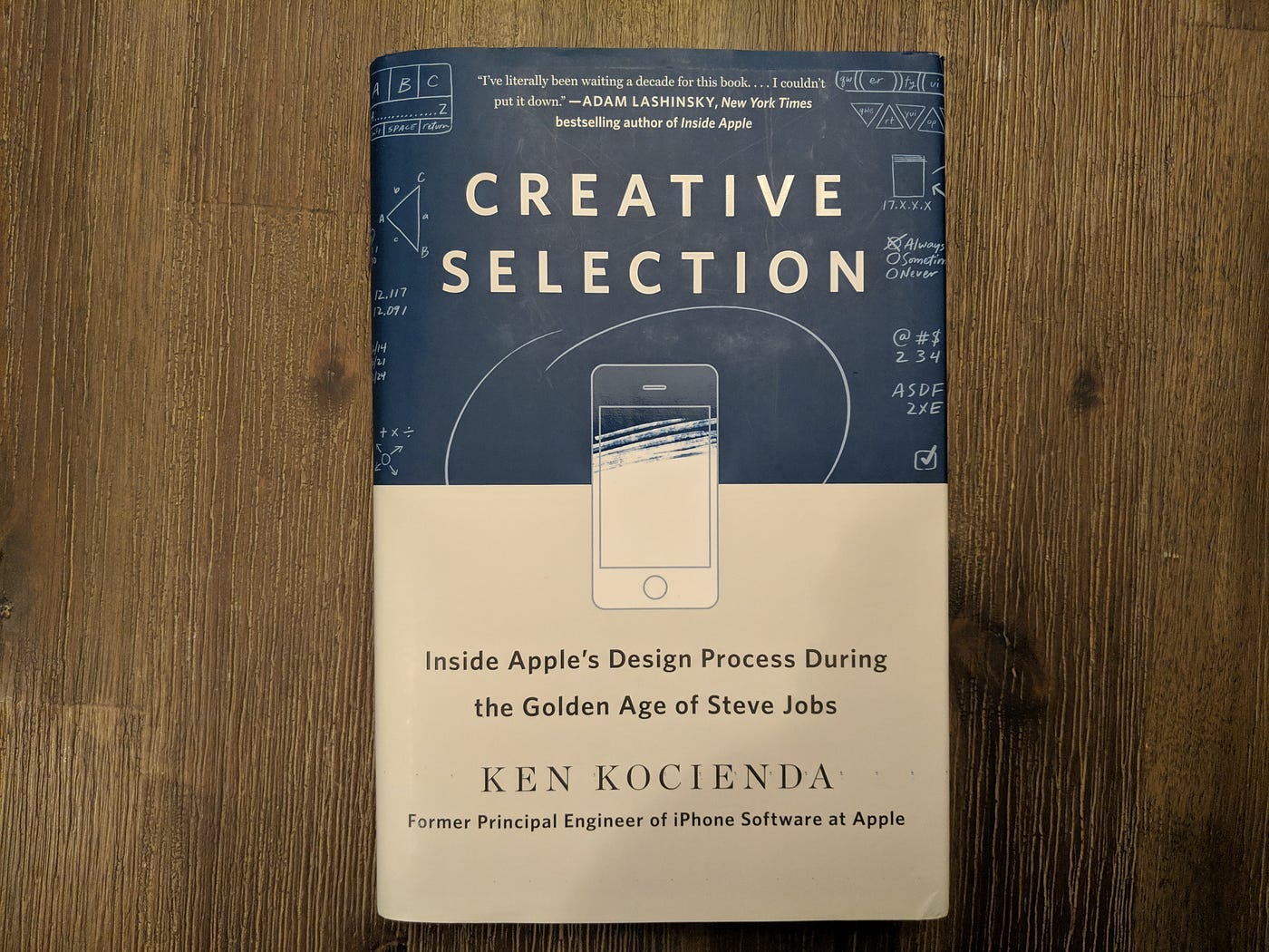
Quotes from "Creative Selection: Inside Apple's Design Process During the Golden Age of Steve Jobs" book by Ken Kocienda
Enjoy reading!
📚 Book quotes
This week I suggest you another book by Ken Kocienda "Creative Selection: Inside Apple's Design Process During the Golden Age of Steve Jobs" Review the quotes and decide whether to read or not:
At Apple, we never would have dreamed of doing that, and we never staged any A/ B tests for any of the software on the iPhone. When it came to choosing a color, we picked one. We used our good taste—and our knowledge of how to make software accessible to people with visual difficulties related to color perception—and we moved on.
We always started small, with some inspiration. We made demos. We mixed in feedback. We listened to guidance from smart colleagues. We blended in variations. We honed our vision. We followed the initial demo with another and then another. We improved our demos in incremental steps. We evolved our work by slowly converging on better versions of the vision. Round after round of creative selection moved us step by step from the spark of an idea to a finished product.
Taste is developing a refined sense of judgment and finding the balance that produces a pleasing and integrated whole.
We used the word “heuristics” to describe aspects of software development that tip toward the liberal arts. Its counterpart, “algorithms,” was its alter ego on the technical side. Heuristics and algorithms are like two sides of the same coin. Both are specific procedures for making software do what it does: taking input, applying an operation, and producing output. Yet each had a different purpose.
Heuristics also have a measurement or value associated with them—the duration for an animation or the red-green-blue values for an onscreen color, but there isn’t a similar “arrow of improvement” that always points the same way. Unlike evaluating algorithms, heuristics are harder to nail down. For instance, how quickly should a scrolling list glide to a stop after you’ve flicked it? We always made demos to evaluate the possibilities.
it’s crucial to make the right call about whether to use an algorithm or a heuristic in a specific situation. This is why the Google experiment with forty-one shades of blue seems so foreign to me, accustomed as I am to the Apple approach. Google used an A/B test to make a color choice. It used a single predetermined value criterion and defined it like so: The best shade of blue is the one that people clicked most often in the test. This is an algorithm.
It was often difficult to decide where an algorithm should end and a heuristic should take over. It usually took us many design and programming iterations to evaluate all the relevant options. The best solutions were an accumulation of small decisions carefully weighed against each other as we sought to tame the complexity of so many compounding and overlapping factors.
it took committed people to breathe life into these concepts and transform them into a culture.
🗞 News and articles
Mike May has prepared a very competent basic guide to typography, in which he collected 11 practical tips.
Mike's Tips:
Try using a single, but well-designed font with gradation by weight. If the font has only one outline, then use color to create a visual hierarchy.
Use ready-made scales with font sizes if you are not sure. When developing a design for the web, convert the values from points to rem
The CJK characters (Chinese, Japanese, Korean) differ from the Latin alphabet in weight, so you need to select separate values for them
If you need italics, then use serif fonts. Inclined grotesques are usually poorly designed
Well, confuse a dash, a short dash and a hyphen. A dash is used to break a sentence, a short dash to indicate ranges of numbers and dates, and a hyphen for hyphenation
Use bullits and quotation marks to design the text. So it will be easier to read
Use only one space after the dot
Remember the proximity theory. The interval between the title and the paragraph should be less than the interval between paragraphs
If necessary, use "Thin Space" or "Hair Space" in HTML. For example, to separate the letters J and K. With the usual space, they will be too far apart, and without it, on the contrary, they will stick together. Example
Do not use paragraph indentation at the same time as the paragraph spacing. Choose one thing
Do not use Helvetica, Inter and Roboto. Choose a font that is not so obvious and used literally everywhere
⚡️ Briefly
Rafael Sepeda has made practical tips for maintaining icon libraries in design systems in Figma.
Maintaining icon libraries in Design systems
AI Demos article about the parameters that will allow you to write a more accurate and detailed promt. In the script, you can specify the width and height of the image, the degree of its uniqueness and the level of detail. The parameters allow you to create similar images, stop the process until the end of generation, choose styles or increase the resolution of the final art.
Midjourney Parameter List: A Guide for Creative Image Generation - AI Demos
An article by Adham Dannaway, in which he first analyzes 9 common mistakes in button design, and then shows an example of a group of buttons that meet the requirements of accessibility and usability. The author also gives 6 tips that will help create the right visual hierarchy of buttons, make them contrasting, convenient for hitting them, and place them at a sufficient distance from each other.
Button design tips to avoid common mistakes - Adham Dannaway
Product Reviews And Ratings UX: A Designer’s Guide
Product Reviews And Ratings UX: A Designer’s Guide — Smashing Magazine
New technologies
The American company Augmental has introduced the MouthPad device — an analogue of a computer mouse in the form of a mouth guard, which is inserted into the mouth and allows you to control a computer, smartphone or tablet using tongue movements. You can scroll pages, control the cursor, use on-screen keyboards, and even play games.
The device will simplify access to technology for people with disabilities of motor functions, as well as representatives of professions who have both hands busy during work, for example, surgeons, astronauts, laboratory staff and others.
Sparks of AGI: early experiments with GPT-4. A speech by Sebastian Bubek from Microsoft about how signs of universal artificial intelligence (AGI) were detected during GPT-4 training, which were not originally embedded in the model, and about whether GPT-4 has intelligence in the usual sense.
Conceptually, there are two types of AI: a highly specialized "ANI", which is taught by people, and a universal "AGI", which will be able to learn independently and perform any task that a person can perform. Some scientists believe that the uncontrolled development of AGI can lead to disaster, and even proposed the concept of "AI alignment", which implies the creation of AI taking into account the values of humanity.
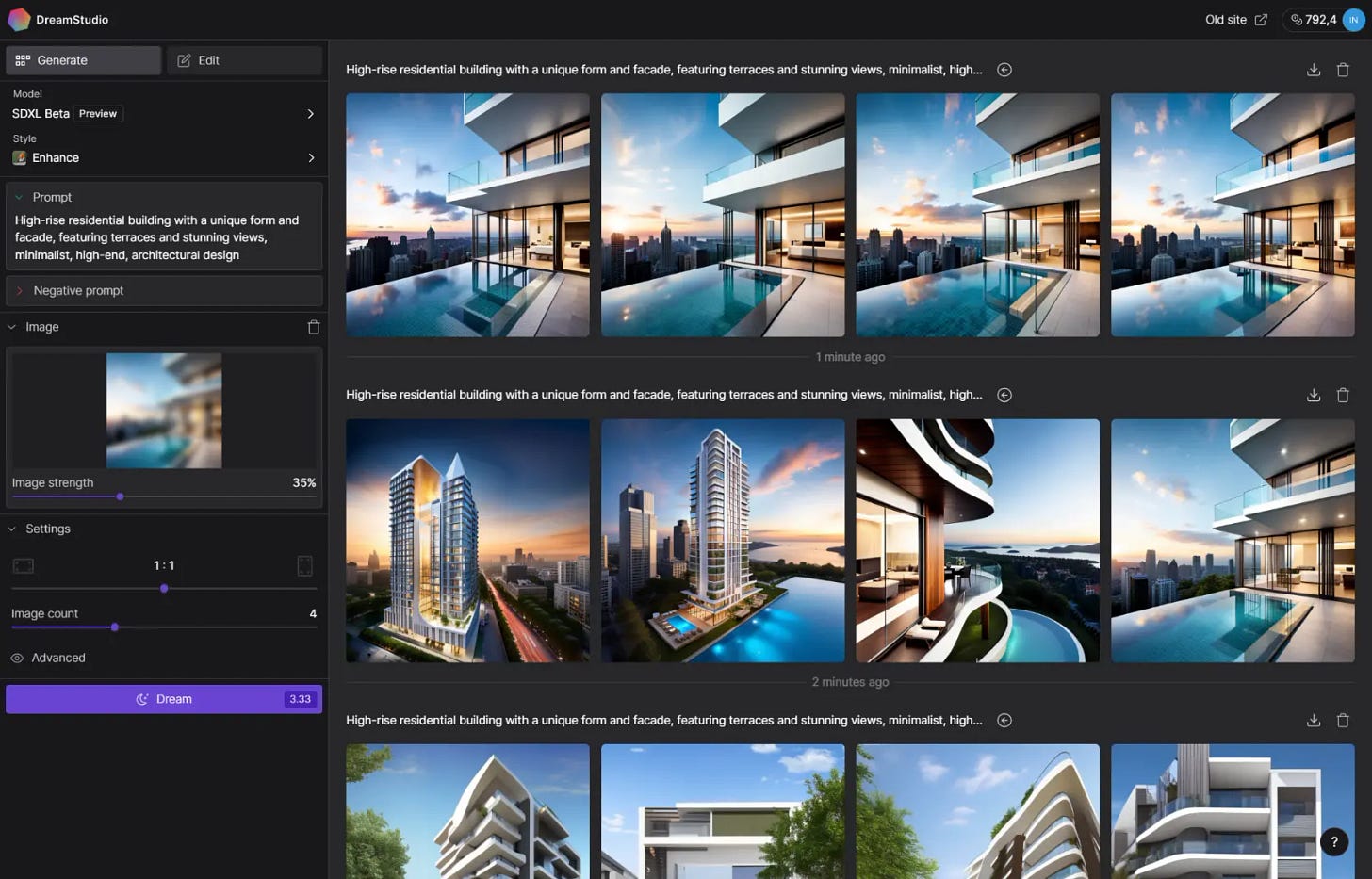
Stability.Ai has released a public beta version of the new model Stable Diffusion XL (SDXL), which contains several times more parameters than Stable Diffusion 2.1. The new model creates more detailed images, better understands human anatomy and is able to generate images with readable text, as well as better understands style hints and requires fewer exclusionary hints.
Currently, SDXL is still being trained, but is already available in DreamStudio, the official browser—based image generator from Stability AI. In order for users to try SDXL, the developers give some free credits.
Article-overview of the SDXL model with examples of created images.
Stable Diffusion XL Beta Available for API Customers and DreamStudio Users — Stability AI
🧘 Inspiration
Branding
Notting Hill Coffee Project. The utilitarian identity of a London coffee shop with an ascetic technical layout and a pleasant orange-black palette.
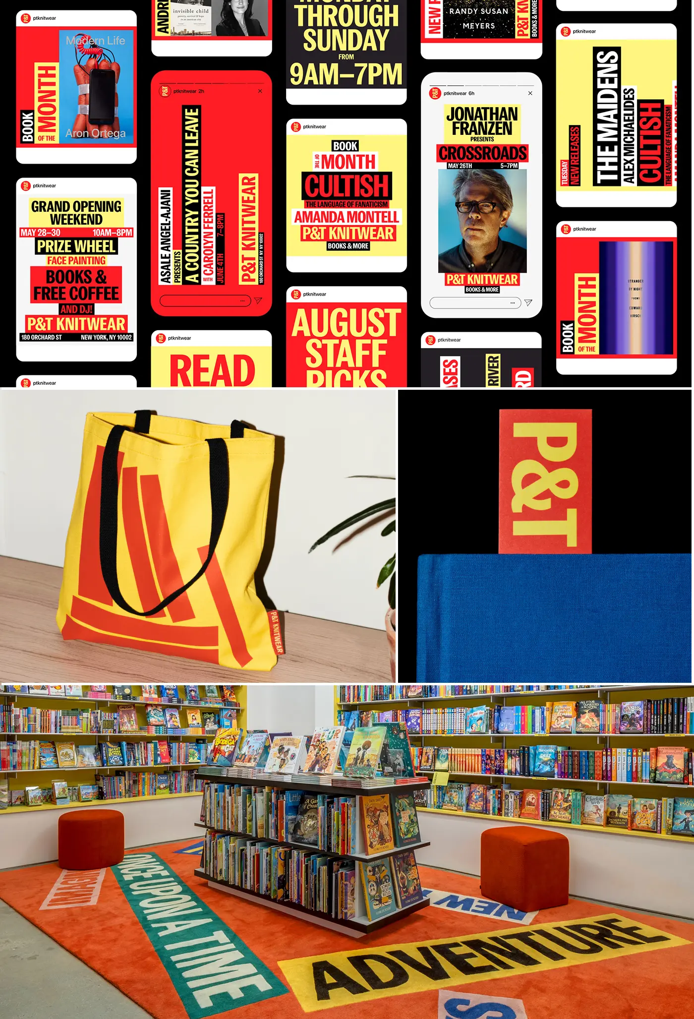
P&T Knitwear. A simple but effective identity of a family bookstore with large slogans and stylized typography for stacks of books.
Keep reading with a 7-day free trial
Subscribe to bezier.design to keep reading this post and get 7 days of free access to the full post archives.


