Issue 60
The ratio between digital totems and Y2K millennium aesthetic analysis
Hello, dear readers! 👋
In this issue, among other things:
How did the Bento trend appear in interface design and how is it good
How color fonts work, where to find them and how to use them
Why is it important to use loading indicators in interfaces
10 techniques for creating an original design from Paula Cher
A video essay on the aesthetics of the noughties
Curated selection of corporate illustrations from large companies
Generator of complex gradients in CSS
A selection of articles and video tutorials about conducting remote usability tests
OpenAI Quietly Shuts Down Its AI Detection Tool
The ratio of men and women among the authors and performers of popular songs in different years
Enjoy reading!
🗞 News and articles
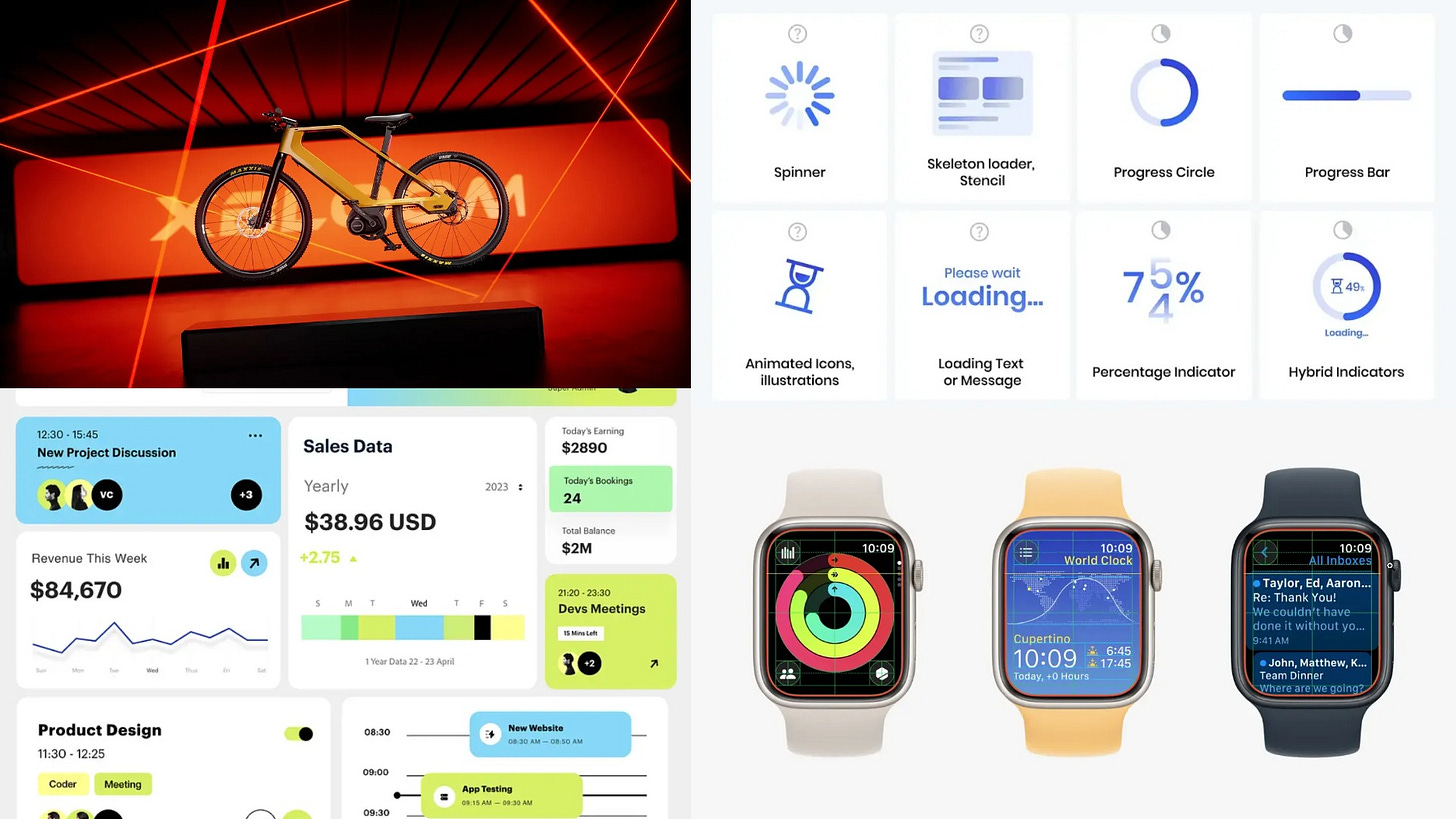
Loading & progress indicators. UI Components series
Taras Bakusevych spoke about why it is important to use loading and progress indicators in interface design, and also explained how to choose suitable indicators for different scenarios.
Main thoughts:
Globally, indicators can be divided into definite and indefinite. The former are used when it is possible to measure progress, and the latter when it is impossible
If the loading time is less than 1 second, it is advisable not to use the loading indicators, so as not to confuse the user
It is better to use indeterminate indicators for loading with a duration of 1-3 seconds. At the same time, you should not use complex animations, because they may not have time to complete
For a waiting time of 3-10 seconds, it is recommended to use certain indicators, with a clear demonstration of progress
If you wait more than 10 seconds, it is important to show a detailed interface showing progress. At this time, it is important to keep the user busy. For example, you can show hints or tell a story about a product
According to the study, the presence of feedback increases the time that users are willing to spend waiting
It is undesirable to use several waiting indicators on the same page, for example, for several cards. It is better to use one global
It is not recommended to increase the waiting time for the sake of playing the animation
When displaying a large amount of content, you can use progressive loading, in which information appears gradually, starting with the most important
Ideally, the user should be able to use the interface at the time of download or cancel the download if necessary. For example, the file download indicator can be placed in a small status bar.
What is the Bento UI Trend, and How Can You Get Started
An article by Louise North about the Bento Box trend in interface design. Louise talked about how this trend appeared and became popular, what are its features and advantages, and also gave step-by-step recommendations for creating a design in this style.
In addition, I recommend looking at the BentoGrids website, which contains a selection of successful examples of Bento visual reception.
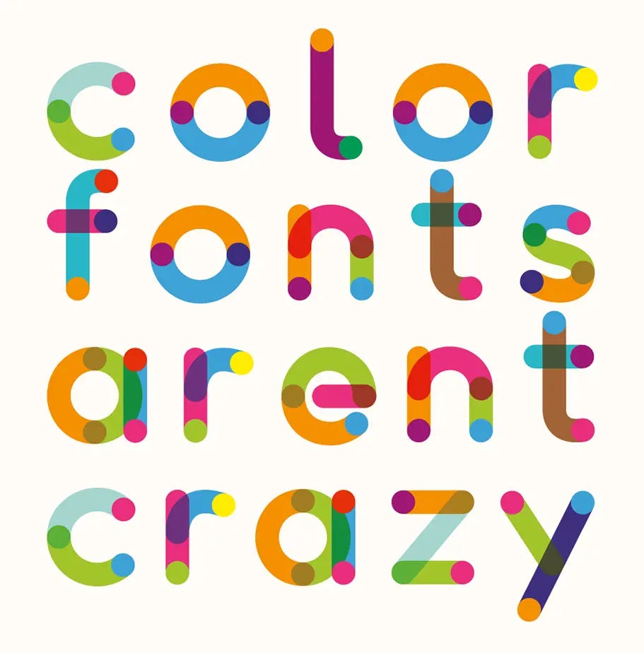
Type.today talked in detail about why color fonts are needed, what color font formats exist, where to find them and how to use them.
The main thing from the article:
Multicolored emojis in the text are the most common color font today
You can make any font color. In this case, the color information is stored in the font file, so the font will not be repainted without translating it into curves.
A predefined color palette gives the designer control over the use of the font, and the layout designer reduces the cost of implementing a design solution.
At the moment there are 4 color font formats: OpenType-SVG, CBDT/CBLC, SBIX and COLR. Of these, only COLR is supported on the web (Chrome browser only)
Gradients and alternative color palettes can be embedded in COLRv1, which allows you to store several color solutions in one color font at once
Theoretically, color fonts can be used in Illustrator, InDesign and Photoshop, but in practice their support is limited. For example, if a font has multiple palettes, the default palette will be displayed
To circumvent the limitations of graphic editors, studios release each color version of the font as a separate file. If there is no such option, then the color can be changed in special editors. For example, in David Jonathan Ross's customizer
If all color font palettes are not listed on the studio's website, then they can be found on the Wakami Fondue website. To specify the desired palette in CSS, it is enough to register its serial number
Figma and site builders such as Readymag or Tilda do not support color fonts.
It is almost impossible to make color variation with smooth transitions. To do this, you need to create a huge number of palettes, and there are very few such fonts
At the time of publication, none of the COLRv1 fonts available on the Internet supports Cyrillic, Hebrew or Greek
⚡️ Briefly
Remote Usability Testing: Study Guide. NNGroup made a selection of articles and video tutorials about conducting remote usability tests. The materials are arranged in the order recommended for study.
Paula Scher’s 10 Rules for Play. Paula Sher spoke about 10 techniques that have helped her create a fresh and original design for more than 50 years.
New technologies
Former Apple design director Imran Chaudhri and his team have developed Humane AI Pin, an AI—based wearable mini projector that replaces a smartphone and projects information from applications onto hands or any other surface.
The finger-sized device is equipped with cameras and optical sensors for scanning the environment, speakers, as well as a smart voice assistant that can answer various questions and give advice depending on the context. For example, he can give advice on nutrition or advise an institution nearby.
Such a device can give birth to a fundamentally new scenario for using AI gadgets. Each person will have a personal assistant who knows the context of what is happening around, while you do not need to constantly look at the screen to use it. According to the developers, AI gives people the opportunity to reconsider their attitude to technology, and personal mobile devices can become faster, more powerful and easier to use.
Project website. Imran Chaudhri's TED talk.
Stability AI updated the SDXL model to version 1.0 and took it out of beta testing. The new version contains up to 6.6 billion parameters, works better with lighting and color, allows you to create LoRA models at a lower cost and can generate images in 1024×1024 px resolution.
Stability AI and its CarperAI lab have introduced Stable Beluga 1 and Stable Beluga 2 — new open-source LLMs.
Both models showed excellent results in complex reasoning, understanding linguistic subtleties and solving mathematical problems. The models also performed well in finding answers to complex questions related to specialized fields, such as law.
OpenAI Quietly Shuts Down Its AI Detection Tool. OpenAI closed their AI Classifier tool without much comment, which was supposed to help recognize text written by AI. The company did not make a public statement, but mentioned the closure of the tool in a note to the blog entry where this tool was first announced. According to the developers, this is due to the low accuracy of the tool.
🧘 Inspiration
Seikatsu. Stylish modern identity of a Japanese bistro and seafood delivery service. The visual language is based on large typography, decorative use of hieroglyphs and simplified geometric illustrations.


