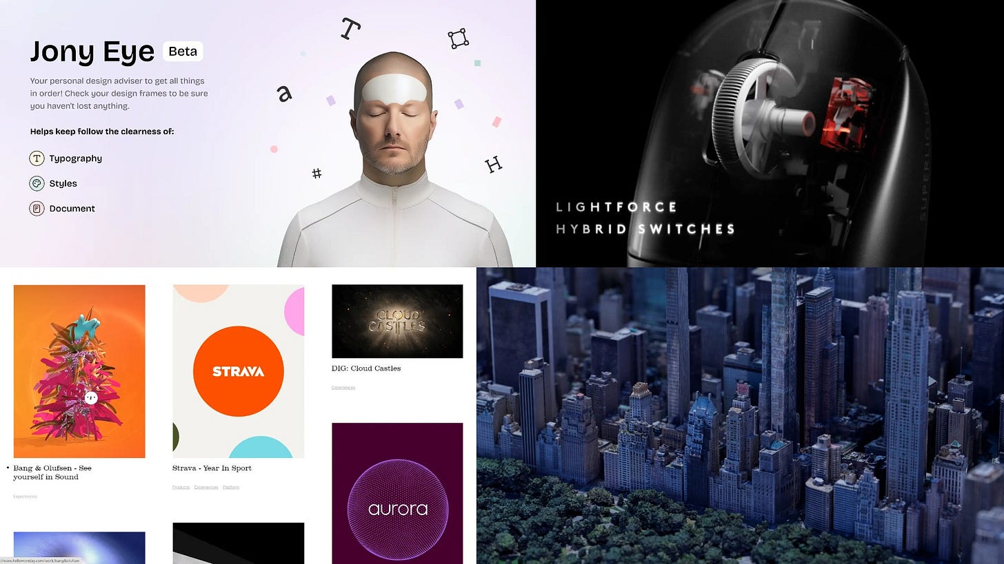
Issue 72
Jony Eye's new approach to superlinear adaptability
Hello, dear readers! 👋
In this issue, among other things:
How should a designer ask the right questions
A new approach to website adaptability design
Example of simplifying a complex diagram
Interview with Karri Saarinen, co-founder of Linear
What is superlinear return and how to achieve it
A large selection of online archives of typography museums
Landscapes created in Houdini based on 3D data from the Google Maps
300+ videos on working with the StarDust plugin in AE
…and much more!
Enjoy reading!
🗞 News and articles
A new approach to website adaptability design
Instead of focusing on the adaptability of the entire page, the author suggests using modern CSS features and making individual components adaptive so that the browser can independently decide when to change their appearance. In this way, you can create pages that will work as flexibly as possible on any device.
The main implications from the article:
People use 2300+ browser width options, which means there is no optimal viewport and adaptability should be flexible.
To achieve flexibility, you do not need to create breakpoints for each width. Instead, you can use the min(), max(), and clamp() queries to adapt individual components.
Some components do not need to prescribe states for each breakpoint. For example, two states may suffice for a header: navigation, collapsed into a burger and expanded
When adapting individual elements, the number of breakpoints will increase, but the total number of states of objects that will have to be designed will become less
If the components change at close widths (for example, 995px and 1000px), then it is worth synchronizing them
In order for independent components to converge together along vertical guides, you need to use global rules for the grid and font styles that will work in specific breakpoint ranges.
Adaptability can also be multilevel. For example, when changing the width of the browser, the block with cards may change, and already when changing the width of the card in this block, its contents will be rebuilt
Great Questions Lead to Great Design: A Guide to the Design-thinking Process
Article by Jorge Perales about why the ability to ask questions correctly is a powerful tool that every designer should be fluent in and that will help find the right design solution.
Jorge talks about the importance of research, how to get to the heart of the problem with the help of precise questions, as well as what they can be, how to prepare them and how to ask them correctly.
The article contains examples of good and bad questions, and also briefly discusses the methods of "Five Whys" and "Who, what, where, when, why and How"
The Negative Impact of Mobile-First Web Design on Desktop
NNGroup was told about content dispersion, an effect that often occurs when viewing websites developed on the basis of the mobile first methodology on a computer. Such sites contain large pictures and low information density, which makes them look excessively stretched on large screens and increase the cognitive load on the user.
To confirm their hypothesis, they conducted 13 usability tests in which they compared the convenience of stretched and compact sites. The results showed that the content scattered on the page increases the cognitive costs of interacting with the site, as well as complicates the search and processing of information.
In addition to negative effects, studies have also shown positive ones. For example, when distributing content, it is easier for the user to concentrate on some part of it. This can be useful when the content on the page is quite complex.
Tips from the article:
When designing for mobile devices, check how the pages look on the desktop. If they are overly stretched, then redesign them so that important content is easy to read
When using large images on the desktop, analyze whether they are worth stretching the page
Place strategically important content in such a way that it is available on one screen and the user does not have to constantly scroll the page back and forth
Avoid the desktop interface elements that are used in mobile design
Use content variance when it can be beneficial. For example, if you need to focus the user's attention on the key blocks of complex content
⚡️ Briefly
How Linear builds product. Interview with Karri Saarinen, co-founder and CEO of Linear, the company that released the famous task manager for startups of the same name.
Karri spoke about the work of the product team, its structure and planning strategy within it, as well as about setting goals, testing hypotheses, internal communication and other subtleties.


