Issue 79
No AI features in Christmas cards

Hello, dear readers! 👋
In this issue, among other things:
How to keep accessibility when using animations for websites
A selection of tips for design systems designers
How to effectively conduct a design review
What is the "Common-Knowledge effect" and how to deal with it
Types of contrast in UI design
Three approaches to implementing AI in the interface
Analysis of the 6 main patterns of smartwatch use
8 main trends in graphic design for 2024
Several big libraries with 3D models and other materials for Blender
A selection of the best personal bots for ChatGPT
Two new generative AI’s: for code and for images
…and much more!
Enjoy reading!
🗞 News and articles
Types of contrast in UI design
Marina Yalanska wrote in great detail about the use of contrast in the interface, its importance and how it can be.
The main thoughts from the article:
For people with visual impairment, contrast is the main parameter that allows you to distinguish objects
In UI design, contrast is one of the key techniques that allows you to build a visual hierarchy and, as a result, make a website or application user-friendly
Contrast can be obtained using color, size, shape, location, texture, and direction
When developing the interface, it is worth testing the contrast in black and white, since the color version may be displayed differently on different devices, and may also be perceived differently by people with visual impairment
There are 7 main types of contrast in typography: in size, color, outline, shape, character structure, text block texture, and line direction. There is also a contrast through isolation, when one word is placed at a distance, and through a violation of the rhythm of the lines
Excessive contrast causes eye strain and complicates interaction
Too many contrast options leads to its absence in general and overloads the user
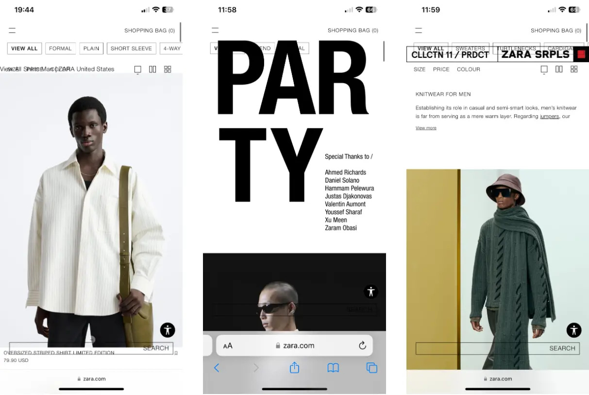
Zara: The billion dollar missed opportunity
Peter Ramsey drew attention to the paradoxically inconvenient Zara website. This is the largest company with a huge turnover, whose online store looks terrible. According to Peter, even basic improvements could bring the company multimillion-dollar profits, and investments in design and development would be minimal.
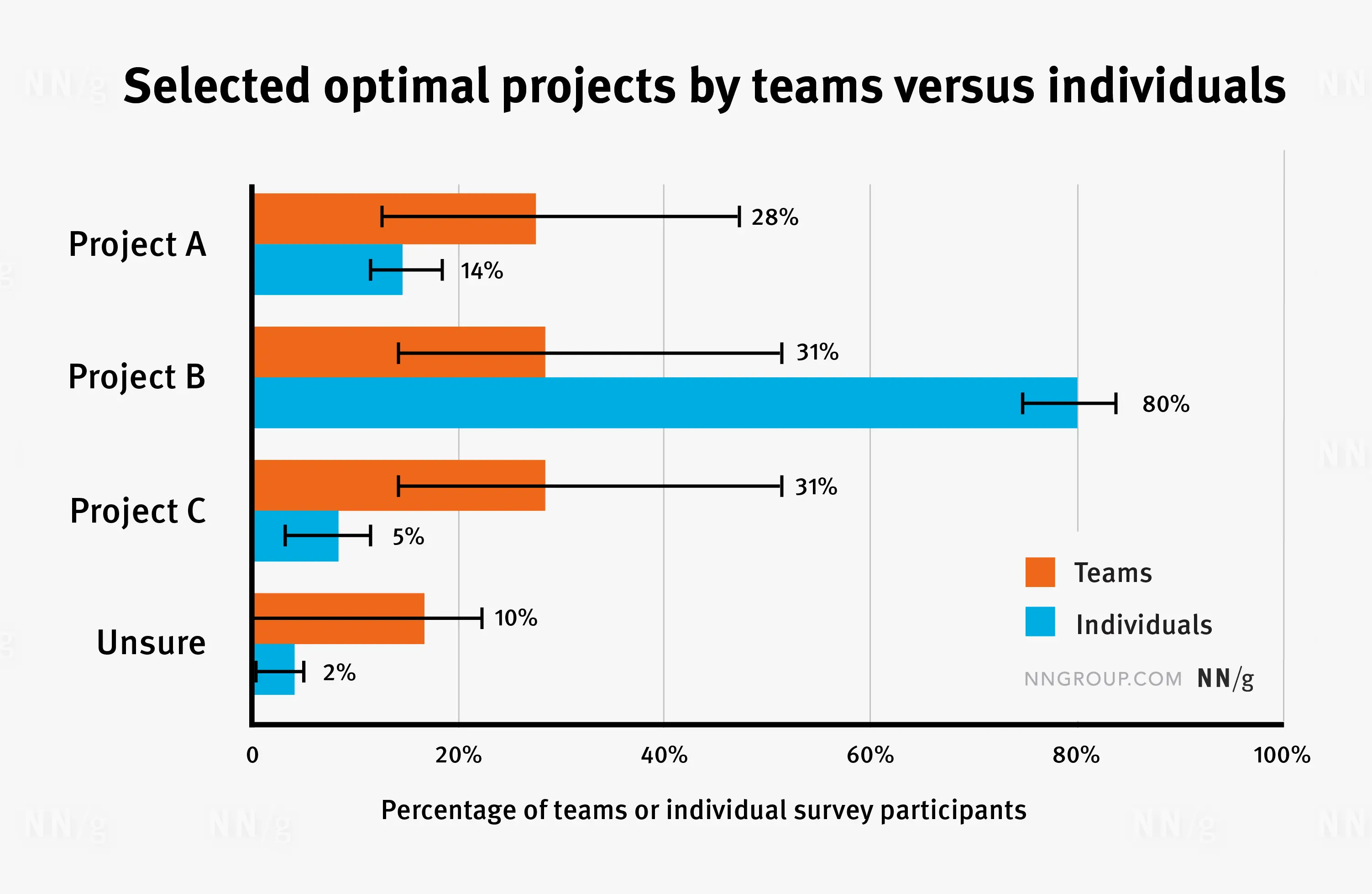
Common-Knowledge Effect: A Harmful Bias in Team Decision Making
NNGroup spoke in detail about the "common knowledge effect" — bias, due to which collectively made decisions are considered more valuable and balanced, compared with the decisions of individual people.
They did a lot of research and found out that teams, on the contrary, often make bad decisions. In such cases, people in the team rely on well-known data, while ignoring the unique information that only a few people possess. In addition, they often have pre-formed preferences and are influenced by their personal motives, which influence decision-making.
At the end of the article, there are a number of tips that will help mitigate the effect of shared knowledge in your team.
Based on his own experience, Marc Cianfrani gave a number of tips to designers who design design systems. These tips will help make design systems more convenient and functional for their users - designers and developers who create the product.
Here are some of them:
You create something that users will have to use. This is different from creating something that they will want to use themselves.
Don't mindlessly copy solutions from other design systems, because you don't know what limitations they were created with
Don't create components for everything
Regularly clean the design system of what is outdated or unused
Once a year, try to answer the question with the whole team: "Why are we doing this?"
Use standard and generally accepted component names. Most of the names have already been invented before you
When creating a manual, set the user up to make their own decisions, and not to blindly comply with the requirements
When updating the design system, make the process safe for all users. Invest in automation and step-by-step guides

Get more out of design reviews
Andrew Duckworth wrote about how to effectively conduct a design review. He has prepared a list of questions that you can ask yourself and the designer. Here are some of them:
What kind of feedback would be useful right now? Designers often show their work very late, so it is impossible to make changes to the design or research
What is the usage context of the design? A good storyteller should immediately identify it
What problem needs to be solved, what efforts are required for this, and is there a guarantee that you will be able to achieve a result? If the designer cannot describe the problem, then he should think it over again with the one who set him the task.
What solutions have you tried and what research have you done? Discussing previously thought-out ideas, even rejected ones, can be very revealing
Who will implement the accepted ideas, test and make changes quickly?
What can go wrong and how can users deal with it? Ask the designer to tell you how he thought it through.
Does the developed design comply with the style guide, design system, or product development plan? If something fundamentally new has been created, then it needs to be justified
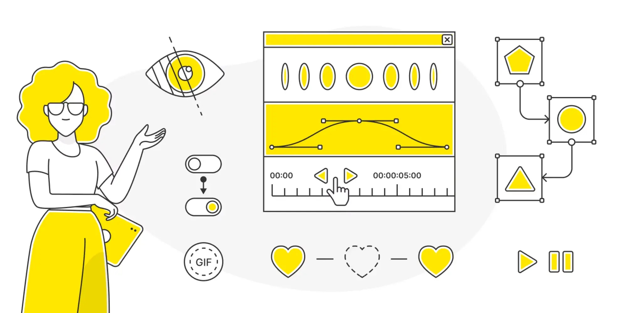
Creating Accessible UI Animations
Oriana Garcia talked about how to find a balance between using animations in the interface and maintaining accessibility. She shared the experience of the team of the large Latin American marketplace Mercado Libre, with whom she developed the basic principles for controlling the availability of animations. In particular, these principles allow you to exclude or limit animations so that it does not reduce the functionality of the product.
Main thoughts:
In people with attention disorders or more severe diseases, animations can cause vestibular disorders: imbalance, nausea, dizziness and others
Animation and movement are two different things. All moving elements are animations, but not every animation involves a change in position
WCAG advises: to allow users to stop animated content, not to use animations that blink more than 3 times per second, and also to create an interface in such a way that it can be used without animation
macOS and other operating systems allow you to set animation limits (reduce motion). This media query can be used to target disable animations for users.
Fundamental simple animations, such as the hover effect on the button, do not require intervention
Long animations that do not affect the use of the interface can be removed or replaced with static or instant transitions. These include parallax, flashes, cyclic animations and videos, moving objects over a considerable distance, and more
Animations that are necessary to use the interface can be mitigated. For example, by reducing their speed