Issue 80
2023 Design Rewind: Part I
Hello, dear readers! 👋
This time, at the end of the year I came up with collecting the best materials for the year. I carefully reviewed all the issues for the year, selected about 300 of the best materials. There are about 150 left. Something that is really worth seeing, reading and applying.
I randomly divided all this stuff into two parts. The first one is in front of you, and you will receive the second one a week later, on January 6. So you will have a large stock of things to watch and read during the New Year holidays and after.
Enjoy reading and I wish you Happy New Year!
🗞 News and articles
The manifesto of the Family studio, in which they call for a balance between traditional design principles and the use of modern technologies.
Important notes from the articles:
Creativity, art and design are a unique expression of human experience based on history and culture. Therefore, they must be created by man himself
Quality is more important than quantity. Instead of constantly chasing the latest tools and technologies, it is important to focus on maximizing the development of existing ones
The benefit of designing is not only to create a new product, but also to improve your skills, as well as to get satisfaction from creating something with your own hands
Creativity and consumption must be conscious, so the design must take into account the impact of the product on the environment and society
Traditional design methods have the same value as modern ones, so it is not necessary to abandon the wisdom and experience of past generations
Good design takes time. By slowing down, we can create more meaningful, effective and durable projects.
A good design combines beauty and functionality, resulting in an item that is both pleasing to the eye and practical to use
Design should not be an isolated activity. It should promote collaboration and mutual learning to reflect diverse perspectives and experiences
A Report on Brand Distinctiveness
A smartly designed report on what percentage of logos, slogans, mascots, colors and products actually differ fundamentally from competitors. The authors conducted a large study involving more than 26,000 respondents from 25 countries, and found that of the 523 brands analyzed, only 15% are truly unique.
An interesting article by Scott Johnson says that the interface patterns of text input on mobile devices are a hat, but few people care about it.
He writes that Android and iOS have a common problem: they copied text editing patterns from desktop computers, but without the menu bar and mouse. This forced them to overload the touch gesture with a wide range of actions: placing the cursor, moving it, highlighting text and calling up a pop-up menu. The result is an overly complex and ambiguous set of gestures, leading to various user errors.
It's not so scary if you type short snippets of text on social media or messaging apps. But more complex actions, such as sending an email, become tedious.
At the end of the article, Scott shows and explains the Eloquent prototype, which offers a much simpler solution for typing on mobile devices.
Visual design rules you can safely follow every time
Anthony Hobday has compiled a large selection of fundamental design rules, including tips on working with color, contrast, spacing, text and visual weight of objects. These rules can be broken if necessary, but even simply following them will make your design better.
Design Tokens: Beginners Guide
Nitish Khagwal has prepared a practical guide on design tokens for beginners. He explained what design tokens are, that they can be used to document what their role is in the design system and how they ensure its flexibility, how semantic and specific tokens differ from global ones, and other subtleties.
Transition animations: a practical guide
A practical article by Dongkyu Lee on what principles should be followed when creating transition animations. He identifies six key techniques:
Smooth appearance and fading with changing transparency
Scaling
Constant direction of movement
Speed Balance
Priorities, order, and grouping of elements
Orientation in space
The author reveals the essence of all the principles using illustrative examples.
A Guide To Getting Data Visualization Right
Sarah Dholakia talked about how to choose the right type of data visualization and considered real-world examples. She suggests considering parameters such as the message you want to convey, the purpose of the visualization, the audience, as well as the type and amount of data. The article also provides an overview of four types of visualization: comparison, composition, distribution, and relationship, and lists the different types of diagrams that are suitable for each category.
Sarah also attached a lot of useful links to the article, among which there is a catalog of diagrams, tips on choosing the right visualization, recommendations on font selection, resources for inspiration and much more.
As a bonus to the article, we recommend several catalogs and cheat sheets on data visualization types:
Catalog of data visualization types by the Copenhagen infographic agency Ferdio. Each of the 160 types has a description and examples of high-quality implementation
From data to Viz. A visual guide in the form of a decision tree for choosing the appropriate type of visualization depending on the data. You can download and print a poster on your wall
Loading & progress indicators. UI Components series
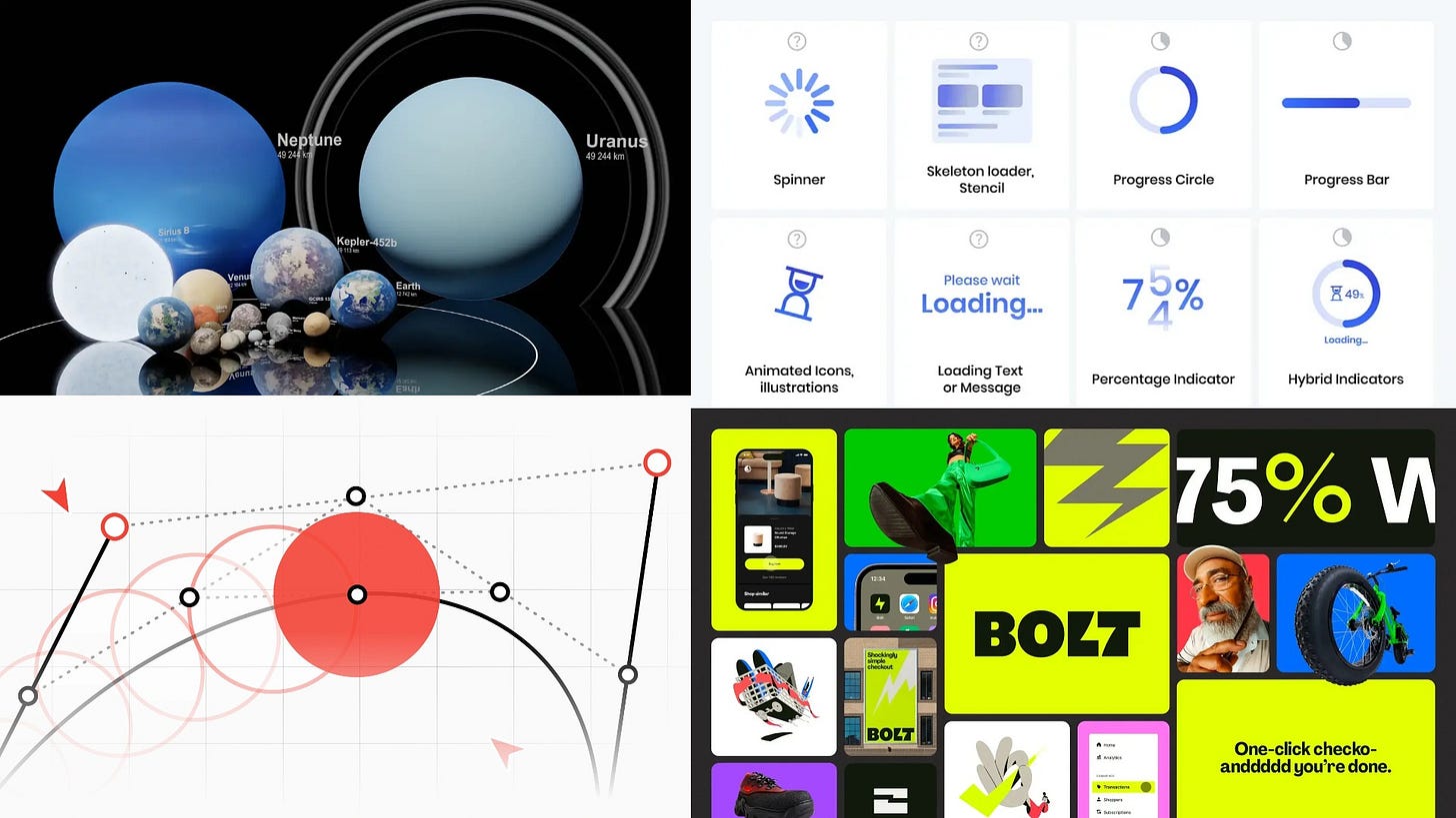
Taras Bakusevich talked about why it is important to use loading and progress indicators in interface design, and also explained how to choose suitable indicators for different scenarios.
Main thoughts:
Globally, indicators can be divided into definite and indefinite ones. The former are used when it is possible to measure progress, and the latter when it is impossible
If the download time is less than 1 second, it is advisable not to use the download indicators so as not to confuse the user
It is better to use indeterminate indicators for loading with a duration of 1-3 seconds. At the same time, you should not use complex animations, because they may not be completed in time
For a waiting time of 3-10 seconds, it is recommended to use certain indicators, with a clear demonstration of progress
If you wait more than 10 seconds, it is important to show a detailed interface showing progress. It is important to keep the user occupied at this time. For example, you can show hints or tell a story about a product
According to the study, having feedback increases the time that users are willing to spend waiting
It is undesirable to use several waiting indicators on the same page, for example, for several cards. It is better to use one global
It is not recommended to increase the waiting time for the sake of playing the animation
When displaying a large amount of content, you can use progressive loading, in which information appears gradually, starting with the most important
Ideally, the user should be able to use the interface at the time of download or cancel the download if necessary. For example, the file download indicator can be placed in a small status bar
Bézier Curves — and the logic behind them
A gorgeous interactive article by Richard Equonnier explaining how Bezier curves are arranged and how they work.
A large report by the branding agency Just Creative on current trends in the branding industry. It contains statistics on pricing, key industry issues, customer acquisition strategies, the use of AI in work, and other issues.
For example, from the article you can find out that 86% of respondents receive clients through word of mouth, 70% already use AI in their work, and 18.8% receive additional income for consulting and other services.
New technologies
A curious article by Ed Zitron on Insider about why metaverses failed with a crash, never gaining popularity over the past three years, and how the vector of large IT companies has shifted towards a more understandable and useful AI.
The main reasons for the collapse of the metaverses, according to Ed:
The unnecessarily grand promises of a futuristic "Internet revolution" and the low quality of the product, which turned out to be extremely far from spectacular presentations. For comparison, watch the presentation of 2021 from Meta, and then an interview with Mark Zuckerberg, recorded in the same metaverse
The clumsiness of VR technologies and the inability to give a clear definition of what the metaverse really is. Even after 3 years, no one can really explain what its essence is and why people should spend their time and money on it
Lack of real user interest despite promising forecasts. For 2022, Horizon from Meta had 200,000 active users per month with a stated goal of 500,000, and the Decentraland metaverse worth $1.3 billion had only 38 (!) active users per day
The slowdown in economic growth and the growing hype around AI. For 2023, Microsoft, Disney and Walmart stopped developing their metaverses and cut tens of thousands of employees, and the main metaverse enthusiast Mark Zuckerberg said that his company is shifting the focus of investments towards AI technologies
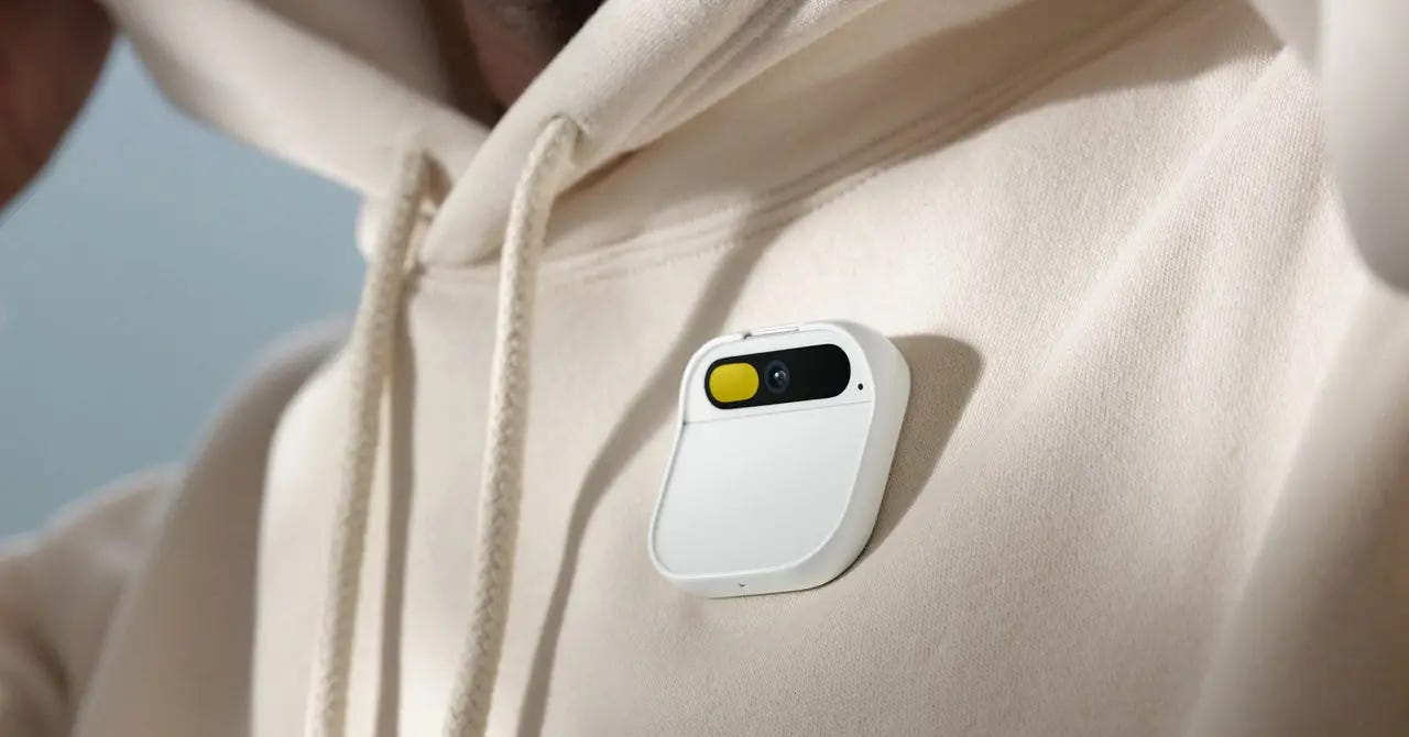
Humane has released Ai Pin, a wearable mini—projector with AI under the hood that replaces a smartphone and projects information from applications onto hands or any other surface.
The finger-sized device is equipped with cameras and optical sensors to scan the environment, speakers, as well as a smart voice assistant that can answer various questions and give advice depending on the context. For example, he can give advice on nutrition or recommend an institution nearby.
Such a device can give birth to a fundamentally new scenario for using AI gadgets. Each person will have a personal assistant who knows the context of what is happening around them, while you do not need to constantly look at the screen to use it. According to the developers, AI gives people the opportunity to reconsider their attitude to technology, and personal mobile devices can become faster, more powerful and easier to use.
Ai Pin can be ordered in the USA at a price of $699, and the first devices will be available in early 2024. Also, users will have to pay $24 per month for unlimited calls, text messages and data transmission via T-Mobile.
🧘 Inspiration
The chic identity of the Maison Revka restaurant with vintage color combinations, experimental font in the logo and detailed engravings. As part of the project, the authors have developed not only brochures and menus, but also packaging designs for the product line.


